Definition
Iconic writing is understood as the creation of sacred images. This is how the Byzantines saw it, and the word “icon” (“εἰκών”, or likeness, image) comes from the Greek language. Initially, in the tradition of the Christian East, “icon painting” meant both the writing of images of saints on boards and the creation of monumental images - frescoes on the walls of churches, mosaics.
Subsequently, since the term “icon” in the narrow sense began to mean a relatively small image, the concept began to be attributed more to images, most often written on a board.
Word stress
All authors of modern dictionaries indicate that it falls on the first syllable. However, all words with the same root, including “icon”, the derivative of which is “ and hemp”, have stress on other syllables, but not on the first one: “iconop and setts”, “iconic ” , “iconography ” . In addition, the word “ik o na” itself in its Greek version has stress on the second syllable. It is from here that the word is often used as “ik o nopis”. This option is given, for example, in the well-known scientific publication “Orthodox Encyclopedia”.
Story
The Jews, among whom Jesus Christ , did not have a tradition of images not only of God, but even of people - such images were absolutely prohibited.
Therefore, the tradition of creating icons goes back to the Greeks, Romans, and other pagan peoples. Their artists have long been able to convey the volume, texture, and individuality of the depicted person.
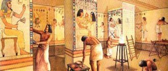
The masterpieces of such painting are, for example, the so-called “Fayum portraits” created using the encaustic technique (painting with molten wax), images on the tombs of the inhabitants of Egypt dating back to the 1st-3rd centuries. They are very realistic, and the colors remain bright even to this day.
Icon as a portrait?
The encaustic technique was also very popular among Christians . So, among the images of the monastery of St. Catherine on Sinai there are images of Christ, Apostle. Peter, also made with wax paints, realistically conveying personality traits.
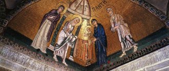
Christ Pantocrator First half of the 6th century. 84 × 45.5 × 1.2 cm Monastery of St. Catherine, Sinai, Egypt. Encaustic icon from the mid-6th century depicting Jesus Christ in Pantocrator iconography. The oldest known icon painting of Christ. The icon was created in Constantinople in the middle of the 6th century and sent by Emperor Justinian as a gift to the Sinai monastery, for which he was building a basilica and fortified walls at that time. The icon was discovered in the monastery in the 19th century. It was established that presumably in the 13th century the icon was renewed (drawn) with tempera painting. The original wax surface was cleaned during the restoration of the icon in 1962.
Iconography is a sacred fine art
One of the most important types of Christian art is icon painting.
First of all, it should be noted that icon painting is not painting, it is the most ancient skill of depicting holy images, crosses and faces of saints. Everything is different here. Thus, the accessories of an Orthodox church - church utensils, which can be purchased in the online store https://blagvist.com.ua/ - have a complex symbolic meaning and a long history of the origin of the ritual. A painter paints pictures, bringing to life his creative fantasies and ideas, while an icon painter creates a sacred icon, which personifies a heavenly spiritual image intended for prayer and praise. The icon serves as an object of reverent worship and therefore everything in it should be extremely serious, devoid of creative inventions. When painting an icon, the icon painter is guided not by personal thoughts and desires, but exclusively by Christian tradition. Holy Scripture and ancient traditions dictated to the icon painter the rules for depicting a sacred icon, not excluding some creative freedom in combining images.
The history of icon painting dates back to ancient times, the first centuries of Christianity; some images that have come down to us from those times are rather symbolic. The first Christians portrayed God as the good shepherd. Persecuted and persecuted, they hid from the pagans in underground caves; it was in such catacombs in Rome that the most ancient images were discovered. This can be called the first stage of Christianity. At the next stage of Christian icon painting, “Byzantine,” imagery appears, ancient art is modified, under the influence of various cultural trends, images become serious, covered with clothes and precious stones. The image of the Savior acquires long hair, a beard and a halo, with which it is currently depicted. During this period, Christian art actively developed, new church holidays appeared, and new beautiful icons were created in their honor.
At this time, the art of icons does not limit the depiction of a holy image exclusively on a board; it can be an image on paper, a wall, a metal surface, or on everyday church items; The icon can also be engraving, embroidery or mosaic. Iconography is God’s word, only it is expressed and narrated not in verbal form, but on a plane. If we consider an icon as a work of art, as a masterpiece of Christian fine art, then, of course, not a single, even the most picturesque, painting will surpass icon painting, first of all, in its spiritual meaning. The technical process of creating icons itself is quite complicated; it is a whole school of icon painting, which has its own personal language and literacy. As in any form of art, there are canons and rules that should be followed; as in any science, there are immediate basics and stages of learning. Depending on the materials, the icon painting technique and reproduction techniques are completely different. The oldest technique is passed down strictly from generation to generation, so every novice master must adhere to the existing rules. Under no circumstances should the image of the holy image and the algorithm for its creation be violated.
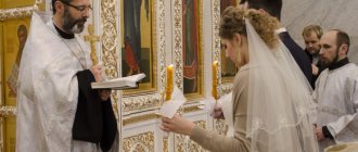
The role of the icon in the life of Christian society is infinitely important. If we recall all the rituals that have marked a sad or happy mark in a person’s life, then each of them, according to the old tradition, is accompanied by the presence of a sacred icon: a wedding, a wedding, the baptism of a child, or a last farewell. The Church sees in the icon, first of all, the personification of a sacred image and the image of the eternal Christian faith, and not a form of art; this is what distinguishes the Christian visual stronghold from the creative painting school.
Tags:
- icon painter
- iconography
- writing icon
- the role of the icon
- Christianity
Latest materials in this section:
- What unusual museums in Russia are worth visiting?
Museum of Garbage "MU MU" Museums, exhibitions, art galleries - remembering this, most often in the head...
2022-01-23
- Works of the sculptor Fyodor Gordeev
Fyodor Gordeevich Gordeev (1744-1810) Among the students of the Russian Academy of Arts in the early years ...
2022-01-14
- Acrylic worlds: Elena Ksanti and her art therapy
Life Line Contemporary painting is paintings in which reality is reflected through immersion...
2021-12-25
- Joachim Govaerts from the Kamphuizen dynasty of artists
Koning, Cornelis Portrait of Dirk Raphaelison Kamphuisen (painted between 1627-1633) In the International...
2021-11-09
- Writing technique. How to understand the picture
Nuances of perceiving art “They use paints, but write with feelings,” said the French living...
2021-10-28
↓↓ Look below for thematic similarities (Related materials) ↓↓
| Next > |
Technique
From the 9th century creators of icons switched to the so-called layered painting. It means that:
- colors never mix with each other; therefore, the icons do not have halftones, or colors such as pink, gray, or other similar ones;
- paints are applied in layers - with a new layer only after the previous one has completely dried.
This is how the principle of “unmerged connection” is realized even in the paints themselves used by the icon painter.
Natural mineral pigments
From the 9th century Icon painters are beginning to increasingly use tempera, that is, powder paints based on minerals diluted in egg yolk, sometimes with the addition of oil. Among the most commonly used minerals are:
- ocher, red and yellow; this is hematite or limonite (the so-called brown iron ore) with clay; red ocher is often used to paint the tunic of Christ, the robe of the Virgin Mary, and yellow ocher is used to make the background of an icon;
- cinnabar is a bright red mercury mineral;
- lapis lazuli is a blue mineral, many others.
Boards
The board for the icon is prepared in a special way:
- first, a small recess is made for the image itself, called the “ark”;
- fabric - pavolok - is glued onto it;
- gesso is applied on top of it - a special primer based on alabaster or chalk.
Interesting fact
Many experts say that such preparation of the board serves for greater strength and safety.
However, priest Pavel Florensky in his work “Iconostasis” draws attention to the fact that the most ancient icons were created not on a board, but not on a stone, which is not accidental: it is this material that most clearly symbolizes eternity, the immutability of the heavenly world. Therefore, in the preparation of the board one can also see a kind of symbolic “transformation” of wood into a stone wall - it is even “plastered” in a similar way.
The process of creating an icon
“Layering” is not only a technique for applying paints, but also a special order for painting an image:
- first, on an already primed board, the artist makes a “draw”, or preliminary drawing, outline;
- after this, the background is made: it can be gilded, when the thinnest leaves of gold are glued to the ground, or simply painted;
- the next stage is the details of the attire of the person depicted, the elements of architecture and nature surrounding him;
- The most important part of the image, the face, was painted last.
Photo by Asya Krasnova
Iconography. Iconostasis. Ikorta
Iconography
[icon painting], a type of painting whose task is to create sacred images - icons. Despite the fact that in the Eastern Christian tradition the Greek. The word ɛἰkῴv (image, likeness, image) is a general name for sacred images (see articles Monumental painting, Fresco, Mosaic, Miniature); as works of art, an icon written on a board is usually considered as a prayer image.
On the development of artistic styles, see the corresponding sections of the articles “Russian Art of the X-XXI Centuries”, “Art of Ukraine and Belarus. XVI-XVIII centuries." (PE. T.: ROC), as well as articles Albanian Orthodox Church, Bulgarian Orthodox Church, Byzantine Empire, Greece, Georgian Orthodox Church, Romanian Orthodox Church, Serbian Orthodox Church, etc.
Method in I.
The icon, which has existed for almost 2 millennia, owes its longevity largely to the conservatism of painting technique, carefully preserved by icon painters until the present day. To understand the specifics of icon painting technique, it is important that the variety of techniques and the richness of the individual handwriting of the artists - the artistic manner of each of the masters - are combined with the constancy of the layer-by-layer painting method, which is an indicator of the stability of the painting system.
The layer-by-layer painting method, known since ancient times, is used to work in any colorful techniques (tempera, oil, fresco, watercolor). As a so-called medieval method, it serves as a means of expression in a special system of painting, which is characterized by reverse perspective, taking into account only distortions of the “close foreground”, while modeling chiaroscuro and color perspective were not used, color contrast was preferred to tonal, and smooth color transitions were not always considered expressive, used color differentiation, selected color dominants based on general local coloring.
The layer-by-layer method is the opposite of the method of mixing fresh, uncured paints on a painting surface, which leads to blurring of the boundaries between color fields. Thus, wanting to convey the originality of the Byzantine painting technique in comparison with the Renaissance, R. Byron and D. Talbot Rice ( Byron R., Talbot Rice D. The Birth of Western Painting. L., 1930. P. 101)
. When layering paints, an immutable condition must be observed - each subsequent layer is applied after the previous one has completely dried, thus not allowing fresh, uncured paints to mix on the surface of the icon. Paint layers differ in density depending on the recipe for preparing mixtures, in which the ratio of the binder and the amount of pigment vary. The size of the particles of the latter could be either very large or small. The texture of the paint surface depended on the ability to prepare colorful mixtures and apply them. Pasty and dense layers alternated in a certain sequence with translucent and glaze layers.
The layering method is not associated with a specific paint technique or with one type of binder, and in this sense it is universal. Thus, it was applicable both for the implementation of enormous monumental tasks and for working with miniature forms. And the main requirement for the binder was its rapid drying. Apparently, the transition to the layer-by-layer method, convenient when working with quick-drying paints, influenced the technique of painting, and primarily on painting with wax paints. It was believed that most of the icons of the pre-iconoclastic period (for example, “Christ Pantocrator”, “Apostle Peter”, “Our Lady Enthroned, Saints Theodore and George”, “Ascension” - all in the monastery of Martyr Catherine at Sinai; “St. John Forerunner", "The Virgin and Child", "Saints Sergius and Bacchus", "Martyr Plato and the Unknown Martyr" - all in the Museum of Western and Eastern Art, Kiev, etc.) were created using the encaustic technique (a labor-intensive technique that requires constant wax heating). However, studies have shown that these icons, despite the use of wax paints, were painted using a layer-by-layer method, which encaustic eliminates: sequential application of paint layers that preserved traces of brush work was possible only with the “cold” technique, when each subsequent layer was applied to an already completely dried lower. Obviously, it was the search for a simpler technology that led artists to painting with wax paints mixed with a solvent (turpentine), which allows them to maintain wax paints for a long time in a liquid state without heating. This type of wax painting is commonly called wax or “encaustic” tempera.
The turning point for Israel was the era of iconoclasm, which ended in 843 with the Triumph of Orthodoxy and the emergence of new aesthetic norms. The mystical side of the icon, which icon admirers mentioned in disputes, forced artists to reconsider many of the technical requirements for creating an iconographic image. After 2 centuries of iconoclasm, wax painting did not revive on the same scale: this semi-antique technique was destroyed along with the generation of artists who owned it. Perhaps, before the start of iconoclasm, this technique was to a large extent associated with the tradition of Iconoclasm, and not secular art, otherwise it, like mosaics, could have found its place in the palaces of iconoclast rulers.
Since the 9th century, the technique of painting icons has been associated exclusively with tempera. In the strict sense of the word, tempera is a method of mixing paint with a binder. The transition to tempera as a simpler painting technique could be due to the need for large-scale restoration of the iconographic fund. In addition, tempera, to a greater extent than the wax technique, contributed to the creation of an ideal “miraculous” texture. Probably, the formation of this idea was influenced by the legend about the Image of the Savior Not Made by Hands,
transferred from Edessa to Constantinople in 916. The compilation of a church service for him “voiced” the mystical ideal of the era and was also intended to help get closer to it visually, standing “face to face.” In Middle Byzantine art, one of the branches of which was the art of Slavic countries, including Russian art of the pre-Mongol period, special painting techniques were developed that allowed the icon painter to embody in paint a great idea - the creation of the image of God.
Even in the technique of wax tempera, two particularly important points were identified that determine the coloristic properties of the icon: the appearance of a white primer, which increased the light scale of color, and the division of colors into layers, which changed the principle of mixing man-made color (on the palette) with an optical one, with an ordered colorful structure. Layer-by-layer painting allows you to reveal the spatial qualities of color, because The passage of light through differently colored media (layers of paint on a binder) creates the main color effect and the visual impression that warm color tones come forward and cool colors recede.
The white primer that began to be used increased the brightness of the reflected radiation, revealing all the diversity of the color spectrum. Various background pads - warm or cold - gave direction to the reflection process, absorbing one or another part of the spectrum, and multi-colored layers built up in a certain order distributed this color scale in space. The method of layer-by-layer application of colors onto white, smooth, often polished soil was the “causative agent” of luminosity, thanks to it the light more actively penetrated deeper. This method was a specific optical system, the physical basis of which from a scientific point of view has not been fully elucidated. Obviously, the properties of the multilayer paint surface made it possible to “organize” the work of external physical light. O. Demus
emphasized that in Byzantine art one of the main tasks was to transform external light into a visual medium
(Demus O. Byzantine Mosaics Decoration. L., 1947. P. 35–36).
Layer-by-layer application of paints changes the principle of color mixing. In general, color is no longer the result of their merging and transformation into an indistinguishable alloy, as in encaustic, but an ordered colorful structure, the essence of which is the unity and separateness of colors - properties that correspond to the main principle of Byzantine aesthetics of “unmerged connection”. Medieval artists knew several ways to mix paints to create complex colors. The first is mechanical, when the required set of pigments is mixed with a binder to create a certain color. The structural expressiveness of Byzantine painting can be traced at the level of the pigment composition of the mixture, that is, it is practically not perceived by the eye as a complete whole. As a rule, small pigments, sometimes dust-like, lie in the lower layers, and larger ones in the upper layers. The Byzantine artist mastered the art of “controlling” the distribution of pigments on the surface of the paint layer, using intermediate glazes that helped him “fix” especially large particles, on which the color of the color depended. Therefore, Byzantine masters especially valued optical mixing methods. In color science, one of these methods is called “incomplete” spatial color mixing. It depends on the texture of the painting surface, which can be strokes intersecting in different directions, echoing the relief of the form or, conversely, unrelated to the form, small and short, thin and elongated. Colorful layers, applied one on top of the other, could merge due to their imperceptible transitions, giving rise to the illusion of mixing. Much depended on the ability to apply layers thinly, working with small brushes. In the intervals between strokes of the upper layers, the lower layers are visible, thereby creating the effect of their unity. Another method of mixing - the so-called illusory - is that when using large pigment crystals located in the lower layers of painting, the paint of the upper layers “rolls off” their sharp edges without covering them. Therefore, it seems that large, intensely colored crystals of minerals such as glauconite or lapis lazuli are found in the upper, bleached layers as impurities, which is deceptive. Thanks to this, external physical light, refracting on their sharp edges, creates a play of colors, enlivening the color.
There are quite a few attempts to explain the high aesthetic merits of Byzantine painting based on the special optical properties of the technique. For the Byzantine artist, aware of the transformative power of Divine light, mastering in practice the process of interaction between physical light and matter, its origin through matter, became a condition for the appearance of form and the manifestation of color in I.
Admission to I.
- this is the order according to which various colorful elements are layered onto the pictorial surface: graphic and pictorial. Its simplest, “abbreviated” version was 3-layer cursive, in which dark and light graphic cuts were applied on top of the main color tone. The work order of a medieval artist can be reconstructed thanks to manuals on painting techniques (“Schedula diversarum atrium” by St. Theophilus, late 11th – early 12th centuries; “Il libro dell’arte o Trattato della pittura” by Cennino Cennini, late 14th century; “Erminia” by Hierom Dionysius Furnoagrafiot, ca. 1730–1733 – despite its late date, the terminology of “Erminia” can be used to most accurately describe the techniques of Byzantine and Old Russian painting). The scheme of the icon painter’s work, corresponding to the medieval painting method, contains several successive stages. First of all, the artist makes a “sketch of the image” on a white primed board, applying a preliminary drawing with a brush with liquid black (less often colored) paint (in an icon, unlike mural painting, it was rarely duplicated with scratched graphite). Then he begins to gild the background, “planting” gold or silver, finely forged leaves on a special glue or varnish. It was “leaf” (in the terminology of Russian jewelers) gold or silver. It differed from the created one (i.e., ground in “creat” together with a binder) not only in its shiny and smooth texture, but also in its economy. The gold on the backgrounds of the icons was polished, so that the “overlapping” joints of the glued leaves were not visible. Under the gold, the icon painter could put a special colored primer - brown bolus, or orange lead, or yellow ocher, but more often the gilding process in Byzantine and Old Russian icons did not require this technology. Sometimes gold covered the entire surface prepared for painting, especially in miniature forms, and then the colors acquired increased brightness. The backgrounds of icons were not always gold. They could be painted most often yellow, but also light green, blue, light brown, bright red, and white. Sometimes the design of the backgrounds imitated the ornamentation of the metal frame or enamels using painterly means. Often the same role - imitation of frame-setting - was played by colored or gold fields of icons, decorated either with inscriptions or medallions with images of saints. The depiction of architectural details, landscape and clothing in I. also obeyed a certain layer-by-layer system, but in contrast to the painting of the face, painting here was less developed. A single average tone was used as a background, on the basis of which 1 or 2 colors were created. White was added to the middle tone and a lightened color was obtained, which they began to layer on the surface of the main tone, simulating the growth of a three-dimensional form. It was completed with whitewash for the spaces, which formed a plastic volume. In the landscape these were slides, i.e. flat stepped tops, in architecture - the structural elements of a building, in clothing - the bend of the folds flowing around the human figure. But, as a rule, the artist was not content with such meager modeling and prepared another, more whitened, color scheme, which he placed under the white spaces, and then the surface of the painting began to seem like a multi-layered color scale. In addition, icon painters loved to make colored spaces by adding admixtures of various crystalline pigments such as ultramarine, lapis lazuli, glauconite or cinnabar to the white, or glazed the white spaces with light and thin layers of color. Optical examination helps to distinguish when pigment crystals lie inside the layer in the form of an impurity, and when on the surface in the form of glaze. In working with spaces, the master’s artistic talent was revealed, his ability to create warm (pinkish) spaces on cold (blue, green) clothes and cold (bluish, greenish) spaces on warm (cherry, raspberry-lilac) clothes. The artist had many such options, and everything depended on his talent, adherence to tradition and the artistic environment in which his work developed. One of the most expressive and modern elements of Byzantine painting was the system of constructing the face. Painting styles that changed over several centuries were, as a rule, accompanied by a change in the figurative structure, the predominance of certain physiognomic types, requiring improvement of technical techniques in accordance with new aesthetic standards. At present, it remains a mystery to scientists on what principle was used to select the techniques that were most preferable in a given era, and what is the reason for their replacement and the appearance of techniques borrowed from other painting techniques.
The principle of modeling the face, based on a strictly ordered system, was perfectly developed in pre-iconoclast history using the technique of layer-by-layer wax painting. A classically developed layer-by-layer system is represented by the painting of the face of Christ Pantocrator on an icon from the VMC monastery. Catherine in Sinai. The main background is a bright yellow spacer, which becomes almost invisible in the completed whole and serves only optical purposes - this detail will be characteristic of all Middle Byzantine, including Russian pre-Mongol painting. The noble light tone of ivory visible to the eye is the 2nd modeling layer. It is applied in several stages and differs in thickness and color, which indicates its correlation with the form. The modeling of the convex parts of the form is completed with pure whitewash “lights”, and the deepening of the form is characterized by 2 shadow colors: gray, grayish-olive, preparing the eye for a gradual transition to the dark color of the beard and eyebrows, and light purple, which serves as a blush and is different faithfulness to nature in the rendering of lips and eyelids.
Observations of color and tonal differences in medieval layered painting served as the basis for the scientific classification of techniques in writing faces. The “sankir” and “non-sankir” techniques and several of their modifications are known: combined, non-contrast and contrast sankir. There is a special order for applying the layers: on the preliminary internal drawing of the face, which in the completed image was usually hidden by the upper paint layers (in some cases, the artists took into account the effect of the drawing shining through the upper layers, then the lines of the drawing could play the role of a shadow), a spacer (“proplasmos” was applied ) – “sankir” of Russian icon painters, i.e. background layer. The following layers were layered on top of it.
The beginning of the artist’s work on the face was the choice of color and texture of the lining layer – “sankirya”: dark or light, translucent or dense. The lining layer on the white primer served as the basis for subsequent modeling. Depending on its coloristic and tonal properties, the artist chose the further course of work. For example, on top of green, olive, brown or even dark purple tones, which absorb light to a large extent, the master could build up warm and light layers, often mixing them with a large amount of white, helping to visually lift and contrast the image. This method required lengthy and detailed study and, judging by the abundance of monuments, was loved by Byzantine masters. It went back to the techniques of ancient painting from the era of its greatest flowering from the 3rd to the 2nd centuries. BC (II and III Pompeian style).
The artist’s work could also be based on a different principle: the initial light interlining layer, luminous in nature, forced more attention to be paid to the shadow parts of the form. Light, often less detailed surfaces left a feeling of “miraculous” primordial nature and permeated with light. There were combinations of different techniques.
In cursive writing, the spacer could remain in the face with the main “flesh” tone, and in more detailed writing it could be covered by the upper layers (in whole or in part), but was visible in the shadows. The gasket was either “solid”, composed on the basis of various ocher colors with the addition of cinnabar white, or conventional in color, i.e. far from the natural appearance (green, olive-marsh, dark brown), composed of glauconite or a mixture of various yellow ocher with black coal or even blue ultramarine and azurite. In the latter case, the dark pad played the role of shadows along the oval of the face and the shadow parts of the volumetric shape (near the nose, around the mouth, in the eye sockets and on the bridge of the nose). The repeated drawing of facial features was applied over the spacer with brown or olive paint and did not always strictly follow the lines of the internal drawing, which were more neat in execution than the lines of the preliminary drawing. In the final stages of work on the face, the drawing was repeatedly refined with a darker tone - brown and black, and in places of contact with blush - cinnabar or cherry.
The shadow color scheme, or “shadow frame,” of the face, directly related to the previous stage (repeated drawing of features), often merged with the drawing, was its thickening, a kind of shading, and therefore coincided with it in color. The shadows were worked on several times at different stages of work on the face, especially with light “flesh” layers. Melting (“glikasmos”), or “ohrenie”, is a layer that was applied over the gasket on the “strong” ones, i.e. protruding parts of the form so that in the recesses and shadows the gasket does not overlap. The melt is lighter and warmer than the lining due to the addition of white and cinnabar to its color. With a small scale of miniature faces or with a not very detailed painting system, melting acquired the meaning of a basic color (“flesh”) tone. Then its color was different from the lining and was based on white, cinnabar and light ocher. But in large “main images” the smelting served as a preparation for the lighter upper layers, and then its color could contain lining pigments – glauconite greens and charcoal mixed with ocher, white and cinnabar.
“Flesh” color (“sark”, “ochre”) is a modeling layer that is even lighter than melting, lying locally, in small islands on the most protruding parts of the form. Where it did not cover the uniform, a swimming trunk was visible, from under which a pad was visible along the edges of the oval of the face. In the “flesh” color there are no longer any spacer pigments - it is a separate color, again composed of white, light ocher and cinnabar. From its mixture with the gasket, the previous color was obtained - melting. Whitening strokes of “highlights” were applied on top of the “flesh” color. Sometimes a light bleaching glaze was laid between them. As a rule, this stage of creating an iconographic image is characteristic of a painting style that uses not only color, but also tonal contrast.
The blush was either adjacent to the “flesh” color and applied on top of the swimsuit, along the padding itself, or slightly covered the “flesh” color. It was a mixture of cinnabar with a small amount of light ocher or white. Blush was applied to the cheeks, shadow parts of the forehead and neck (creating the effect of “warm” shadows), lips and the ridge of the nose. On the upper, brighter lip, the blush contained almost pure cinnabar, on the lower lip there was a mixture of paint. On the ridge of the nose, the blush looked like a series of pink-red lines of increasing color intensity. Often the blush merged with the shadows that accompanied the brown contours, which gave the painting a special harmony.
Whitening highlights, or “sveta”, completed the most convex parts of the form. Depending on the degree of detail of the painting, pure white “lights” could be applied both to the melting and to the “flesh” color. With a particularly skillful technique, you can see additional bleaching glaze underneath them. “Sveta” are extremely varied in texture: they could be picturesque relief strokes, linear shading, or a soft, blurry spot. Often, researchers see certain stylistic trends in the way they are applied to the surface of a painting. Fundamentally, they are also connected by the ancient technique of “surface lines,” which most fully revealed the idea of creating a three-dimensional form on a plane. Therefore, they provide extraordinary scope for an experienced artist to demonstrate virtuosic techniques and, on the contrary, easily turn into a craft routine if there is a lack of training.
The icon was completed with a transparent, shiny covering layer, cooked using a special technology from vegetable oils, which Russian icon painters called drying oil, and which gave the paints a special brightness. Drying oil also protected paintings from moisture, dirt and light mechanical damage. However, after 50–80 years it darkened, absorbing soot from candles and dust from the air. They tried to “wash” the icon to update its painting, which had a negative impact on the preservation of its original layer. Judging by archaeological finds in the workshops of artists in Novgorod and Kyiv, at an early stage in the history of Russian iconography, drying oil was cooked from imported olive oil with the addition of amber; later it began to be obtained from linseed oil, widespread in Rus'.
The painting system, based on the layer-by-layer method, existed until the New Age, when the foundations of traditional icon painting underwent radical changes.
A. I. Yakovleva
Iconography of the Synodal period (XVIII - early XX centuries)
in Russia for a long time remained outside the interests of specialists as a subject not comparable with the masterpieces of icon painting of the 11th-17th centuries. Only since the mid-80s. XX century Publications began to appear that introduced icons from the 18th century into scientific circulation. XX century These works gave an idea of the national religious and artistic culture with new features of an iconographic, stylistic and technical nature.
Unusual methods of performing icons gained the right to exist already in the middle of the 17th century. Mostly, the masters of the Armory introduced into icon painting practice not only elements of “life”, but also new technical techniques. The first Russian treatises by Joseph Vladimirov and Simon Ushakov provided a theoretical basis for the renewed process of icon painting. The practical horizons of national icon painting were also expanded by foreign masters who were part of the royal workshops. These quests took on a purposeful character during the era of the reforms of Peter I. Church art went in several directions. The official one was represented by the direct participation of Western European masters, i.e. For the new churches of the new capital under construction - St. Petersburg, religious works were created within the framework of academic painting. The masters of the Armory, who still retained their influence, adhered to a compromise style, combining centuries-old techniques with elements of naturalism. And only the Old Believers and conservative circles of society in Moscow and the provinces remained committed to traditional icon painting.
Systematic research into the technique of late icon painting began to be carried out only in recent years and mainly within the walls of the State Research Institute for Restoration (GNIIR), which in the 70s of the 20th century. began to engage in icon painting XVlll – beginning. XX century For this purpose, the same tools are used as in the study of ancient icons (analysis under a microscope, radiography, special types of photography, chemical analysis, observations by art historians). Icons, or, more precisely, religious icon paintings belonging to the 1st direction, were already painted within the European tradition not only on wood, but also on canvas. The technique of their creation is practically no different from generally accepted academic painting. In the 2nd and 3rd directions, a traditional wooden panel was used as a base, reinforced with various shapes of dowels - mortise, profiled, counter, one-sided, overhead, end, “swallows”, etc. The shape of the icon board becomes more diverse (for example. , has figured boundaries defined by the frames of iconostases and icon cases of a baroque nature), although in the processing of the board the ark, husk, and sometimes the conventional 2nd ark in the form of a side along the edges of the board are preserved, but an absolutely flat surface is increasingly used.
At the next stage, the treated surface of the board was glued with pavolok using the generally accepted technology to prevent drying out and cracks. However, its use in the 18th-19th centuries. becomes almost optional or partial. This did not exclude complete covering with pavoloka. Thanks to radiography, it is possible to observe the fragmentary gluing of small patches of a heterogeneous nature, covering the most dangerous places, such as areas with knots, all kinds of cavities and mechanical damage to the wood. Later, icon painters used paper sheets, pages from books, and even newspapers instead of pavolok. Gesso soil still retains its importance. However, preference is given to gypsum gesso instead of the chalk gesso adopted in ancient icon painting.
Basically, the technique of icon painting remained the same; traces were used, which determined the iconography and composition of the work. First we did the background and minor details, then we moved on to the personal. Along with a plain (ocher) coating, gold was often used for the background, both sheet and melted, which was applied to a reddish polyment. Created gold was more often used to develop various parts, incl. vestments. Backgrounds were often “enriched” with additional decor. The craftsmen used stamp forms with which they imprinted relief ornaments on the raw gesso, as can be seen in the fragment of the over-primed 18th-century background preserved by the restorers. on the icon of the Mother of God from the Deesis rank and the Great Martyr. Demetrius of Thessalonica in Uglich (XVI century, GGG: Avtonova, Mneva. Catalog. T. 2. P. 468–469. Cat. 990). Shotting of backgrounds also became widespread, when ornaments and patterns were embossed on gilded gesso, or ciphering was done - scratching ornaments with a needle on gilded ground. In some cases, when it comes to “replicating” specific, especially revered icons in frames, imitation frames have been encountered.
In the development of the personal, traditional techniques were generally preserved. However, highly professional craftsmen often turned to the selection technique, in which the faces and open parts of the body were made with the thinnest short strokes, not merging and sometimes crossing each other.
Folk artel icon painting was distinguished by its primitive execution, although one can note unique technical and professional techniques in it, aimed at quick execution and a certain iconic “readability” of the image. On a thinly laid ocher background, iconographic schemes were sketched with quick strokes, filled with single-color colorful spots, in which images popular in peasant everyday life are easily recognizable, for example, the Mother of God “The Burning Bush”, St. Nicholas the Wonderworker, patrons of livestock breeding. George, Saints Modest of Jerusalem and Blaise of Sebaste. Poor-quality topcoat varnish on such icons “turned red” over time, for which these icons received the name redneck. Many of them were covered with stamped brass frames. Along with the latter, handmade frames made from carved foil were used, the production of which was carried out mainly by women in Mstera and Kuban. Under them, according to a simplified scheme, only faces and hands, visible in the slots of the frames, were executed on the boards. Such icons were called “podkladniki”. The products of traveling artels were called “traditional” icons.
The image of the icon painting technique of this period is also complemented by some still little-studied features of a regional nature. In folk icon painting in the Urals (not to be confused with Nevyansk icons), colored varnishes were used. Kuban icons were distinguished by the originality of their execution. Their simplified interpretation is dominated by iconographic schemes of a Western nature, adapted to familiar Orthodox images (for example, the “Christ in the Press” icon). Written on thin small tablets in an academic manner, they were lavishly decorated with virtuoso decorative foil frames. Chemical analysis of the pigments and binders used has not yet been carried out.
Frequent violations of technical processes in icon painting, especially in the 19th century, led to a fairly rapid destruction of the soil and the paint layer of the icons. Therefore, there are cases of complete renewal of icons after a fairly short period of time from the moment of their execution - after 20–30 years.
MM. Krasilin
Lit.: “About the binder”: Manuscript of an unknown master, stored in Bern // Communication. VTsNILKR. M., 1961. No. 4. P. 196; Berger E. Beiträge zur Entwickelungsgeschichte der Maltechnik. Münch., 1912². Folge 3: Quellen und Technik. der Fresko-. Oel- und Tempera-Malerei der Mittelalters von der byzantinischen Zeit bis einschliesslish der “Erfindung der Oelmalerei” durch die Brübder Van Eyck. S. 18–19; Schmid G. Antique fresco and encaustic techniques. (M.) 1934. S. 112, 126; The materials and Techniques of Medieval Painting. NY, 1956. P. 55; Theophilus. De diversis artibus/Ed. and transl. CR Dobwell. Oxf; NY 1961; Slansky B. Painting technique. M., 1962, S. 337; Theophilus manuscript “note on various arts” // Communication. VTsNILKR.M., 1963. No. 7. pp. 66–194; Matxew G. Byzantine Aesthetics. L., 1963. P. 1, 29–30; Pertsev N.V. On some techniques for depicting a face in ancient Russian easel painting of the 12th-13th centuries. // Message Timing belt L., 1964. Issue. 8. pp. 89–92; Volkov N.N. Color in painting. M., 1965. S. 103–106, 110; Chatzidakis M. An Encaustic Icon of Christ at Sinai // The Art Bull. NY, 1967. Vol. 49. N 3. P. 197–208; Winfield DC Middle and Later Byzantine Wall Painting Methods // DOP. 1968. Vol. 22. P. 61–139; Birshtein V.Ya. Methods of analysis and the problem of identifying binders. // GBL: Information Center on Issues of Culture and Art. Overview information. M., 1975. S. 35–49; Weitzmann K. The Monastery of St. Catherine at Mount Sinai: The Icons. Princeton, 1967. Vol. 1. P. 18; Bykova G. Z. Restoration of the encaustic icon “Sergius and Bacchus” of the 6th-7th centuries. from the Kyiv Museum of Eastern and Western Art // Artistic heritage: Storage, research, restoration. M., 1977 Issue. 2 (32). pp. 124–134; she is the same. Research and restoration of the encaustic icon “Martyr and Martyr” // Ibid. pp. 104–111; Kitzinger E. Byzantine Art in the Making. L., 1977. P. 120; Birshtein V.Ya., Tulchinsky V.M. Identification of some materials of painting the icon “Martyr and Martyr” using the method of IR spectroscopy // Artistic Heritage. 1979. Vol. 5 (35). pp. 198–202; Popova O.S. Art of Novgorod and Moscow 1st half. XIV century M., 1980. S. 82–87; Muzeus L.A., Lukyanov B.B., Yakovleva A.I. The oldest pre-Mongol icon from the Moscow Kremlin museums. // Artistic heritage. 1981 Issue. 7 (37). P. 99; Yakovleva A.I. “Erminia” of Dionysius from Fourna and the technique of icons of Theophanes the Greek // DRI M., 1984. [Issue] XIV-XV centuries. pp. 7–25; she is the same. Origins and development of pictorial techniques of Russian monuments // DRI. M., 1993. [Issue:] Problems of attribution. pp. 54–71; she is the same. Icon technique // History of icon painting. VI-XX centuries Origins, traditions, modernity. M., 2002. S. 31–39; Golubev S.I. Painting technique in the artistic structure of the Byzantine icon // Material culture of the East: Collection. Art. M., 1988. Part 2, pp. 254–273.
A.I. Yakovleva
Subjects and symbolism of color
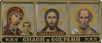
The icons depict:
- Christ;
- Mother of God;
- saints; Among them there are quite a few where scenes from the life of the saint of God are written in the margins around the “ark”.
- Angelov.
In addition, a special group of images are dedicated to holidays, especially significant events of the church year.
The colors used by icon painters have their own symbolism:
- white – the light of the Kingdom of Heaven (for example, on the icon of the Transfiguration);
- red – Deities;
- blue – earth; It is characteristic that Christ is written dressed in a red tunic, a blue himation (the Divinity clothed with Humanity), and the Mother of God - in a scarlet tunic and a blue tunic - that is, humanity is clothed with Divinity through the Incarnation of Christ;
- green – the color of life, nature; green himation - on an Angel, which, according to a number of interpretations, symbolizes the Holy Spirit on the icon of St. Trinity St. Andrey Rublev;
- finally. The underworld, Hell, is written in black.
Features of Orthodox icon painting
The most important of them can be considered reverse perspective, the basic principle of imagery. If in direct perspective it is similar to a photograph taken from one point, then in reverse perspective we, for example, can see:
- at least three planes of the table (and not one, if it were a painting), as in the image of the Holy Trinity by St. Andrey;
- part of the face turned in profile, which would not be visible in a portrait familiar to a modern person; hence the seemingly “disproportionate” faces on the icons of the Virgin Mary with Christ.
According to the famous culturologist B.A. Uspensky, this means that the master creating the icon is immersed in what is depicted and “lives” in it. But the researcher of Byzantine culture A.M. Lidov thinks a little differently: with reverse perspective, the image, in fact, is located between the plane of the board and the person - simply, next to him. This was especially acutely understood by Russian peasants, for whom it was customary to hang up icons if there was an intention to sin in some way, so as not to see accusatory glances.
Differences between icon painting and painting
Constituting a special branch of painting, icon painting, however, differs significantly from this art in the generally accepted sense of the word. Painting - whatever its direction, realistic or idealizing - is based on direct observation of nature, takes forms and colors from it and, providing, to a greater or lesser extent, scope for the artist’s creativity, involuntarily reflects his individuality; on the contrary, icon painting, without turning to nature for reference, strives only to unswervingly adhere to the principles sanctified by tradition, repeats long-established types of images that have received, so to speak, dogmatic significance, and even, with regard to technical techniques, remains faithful to the precepts of antiquity; the performer of such works, the icon painter (isographer), is a completely impersonal worker, stereotypically reproducing compositions and forms once and for all indicated to him and his brothers and, if he has the opportunity to show his skill in anything, then only in the thoroughness and subtlety of the work. Icon painting acquired such a character in Byzantium depending on the establishment by Orthodoxy of unshakable dogmas of faith and unchanging church rituals; from here it passed to Italy, where it was respected and imprinted on local art until the advent of the Renaissance; Having been transferred from Greece, together with Christianity, to our fatherland, it took root in it and to this day occupies many hands among us and enjoys preference among the masses over religious painting in the spirit of Western Europe. art schools. Leaving aside Byzantine icon painting itself, let's take a quick look at the history of this art in Russia.
Byzantine icon painting
It reaches a special peak after the VII Ecumenical Council, from the 9th century. In no more than 100 years, an iconographic canon is formed and the main subjects are developed. From the 12th century Iconic writing is gradually declining due to the political situation in the country. However, until the 16th century. famous icon painters of St. Mount Athos.
Angel Golden hair. Unknown icon painter. Second half of the 12th century Russian Museum, St. Petersburg
The art of icon painting of Ancient Rus' (Kievan Rus)
Of the masters of this time, the most famous is St. Alypiy, monk of the Kiev-Pechersk monastery . They said that the images he painted were considered miraculous. And the last icon, which one lover of God ordered for the saint, was not finished by the already ill master - it was completed by an Angel who appeared to him. One can only guess about how rich the iconography of Ancient Rus' was - most of these treasures were destroyed during the Mongol invasion.
Icon of the Mother of God of Pechersk-Svenskaya, Tretyakov Gallery.
brief history of icon painting
Iconography - (icon and write) - icon painting, theology in colors - a type of religious painting based on the Tradition of the Christian Church and the Holy Scriptures. Icon painting creates sacred images that are called upon to raise worshipers from image to prototype, hence the frequent name of the icon - image , in modern language, a projection of the spiritual world in the material.
Icon painting originated in apostolic times. In the first century after the Nativity of Christ, according to Church tradition, the first icon was painted by the Apostle Luke himself on a simple wooden tabletop. This image began to be called the image of the Vyshgorod, and then the Vladimir Icon of the Mother of God of Tenderness, so named after the transportation of the icon of St. Prince Andrei Bogolyubsky to Vladimir. From the first centuries of Christianity, even during persecution, Christians began to depict the foundations of their faith with symbols. Evidence of this is the paintings in the Roman catacombs that have survived to this day.
Icon painting survived the period of iconoclasm . For two centuries (from the 8th to the 9th), the persecution of holy images continued, which were declared idols, and the people who worshiped them idolaters. The result of iconoclasm was the barbaric destruction of icons, frescoes, mosaics, the destruction of painted altars in many Byzantine churches, and icon worshipers were persecuted and destroyed. The Council of Constantinople in 842 restored the veneration of icons and condemned iconoclasm . After the council, which condemned iconoclasm and restored icon veneration , a church celebration was held, which took place on the first Sunday of Lent. In memory of this event, on the first Sunday of Great Lent, the Church established a holiday for the restoration of icon veneration , called the “Triumph of Orthodoxy.”
Traditional icon painting in Russia was borrowed (like the entire structure and Rules of Divine Services) from Byzantium. The first teachers of icon painting were invited from there. Icon painting began in the 10th century and was marked by the Baptism of Russia. Icon painting was the leading church-based fine art in Russia until the 8th century, when it was gradually replaced by secular types of fine art. Icon painting schools appeared in various principalities. This conventional division into schools according to principalities was not without reason, because each school was characterized by an individual writing style. A distinctive feature of each icon painting school is iconographic design , i.e., in other words, the manner of applying the drawing to the board, the color scheme and the cutting of clothes. The classical school of icon painting has always been the school of the Moscow Principality, the founder of which can be considered Ave. Andrei Rublev, Dionysius with his sons, Daniil Cherny. The drawings of the Moscow school were distinguished by classical, strict and correct proportions of figures, faces and other elements of icon painting compositions , the influence of the Byzantine style, golden backgrounds, richly decorated clothes with gold, etc.
By the 18th century, icon painting began to undergo stylistic changes. A tendency towards greater realism emerged; behind the desire of icon painters to overcome iconographic conventions and subordinate compositions to realistic laws, the spiritual component of iconographic images began to slip away. The so-called parsuns appeared - an iconographic image of living people, the ancestors of the portrait.
Under Peter the Great, icon painting completely faded into the background. The Academy of Arts was founded. Artists went to study abroad. Art began the path of secularization. This trend was also visible in the spiritual life of society. In parallel with the acquisition of European values, Russia was losing its spiritual heritage - icon painting . A characteristic feature of that time was the appearance of realistic painting, civil buildings in the European style, the appearance of art styles dictated by Europe (rococo, baroque, classicism, romanticism, etc.), secular literature and poetry, and science. The emphasis was shifted from the spiritual to the secular, worldly. Hence the concept - secularization.
In subsequent centuries (XVIII and XIX centuries), icon painting was transformed into temple painting, which had nothing in common with ancient canons and traditions. The symbolic component has gone, realism and detail have appeared, distracting from spiritual and mystical contemplations, giving free rein to fantasies. Iconographic canons have gone into oblivion . Now “icons” are painted not by monks, not by initiated persons, but by simple artists, albeit eminent ones, but sometimes even with little church (Vrubel, Nesterov, Vasnetsov and others). They, of course, tried to understand, delve into, study the issues of icon painting of our ancestors, but traditions seemed to be irretrievably lost.
The 20th century gives us the name of Andrei Rublev. At the beginning of the century, Igor Emmanuilovich Grabar realized the lack of authentic works of Russian medieval painting. A whole layer of the history of fine art for many centuries was forgotten and lost. At this time, under the leadership of Grabar, the clearing and restoration of many monuments of fine art began. The result was the appearance in our world of many works of icon painting from the Middle Ages. The most significant discovery of the restorers of that time, who worked in the Moscow Kremlin, the Trinity-Sergius Lavra and Vladimir, was the clearing and discovery of icons by the 15th-century icon painter, monk Andrei Rublev.
The first quarter of the 20th century was characterized by the beginning of the revival of the ancient Russian art of icon painting !
Golden age
It is associated with the revival of the country in the 14th century, which it largely owes to the giants of the spirit - with W. Peter, Alexy of Moscow , Venerable. Sergius of Radonezh . At the same time, St. Peter himself was an icon painter, and St. The image of the Holy Trinity was dedicated to Sergius by St. Andrey Rublev . It was his work that largely determined the 14th century. as “golden” for Russian icon painters.
Iconography: Hospitality of Abraham (Old Testament Trinity) Dating: XV century. 1425–1427. Icon painting school or art center: Moscow school Icon painter: Andrey Rublev Origin: From the Trinity Cathedral of the Trinity Lavra of St. Sergius. Material: Wood, tempera. Dimensions of the icon: height 141.5 cm, width 114 cm The scene of the silent communication of three angels is brilliantly revealed by the icon painter in the gestures of their hands - the left angel (God the Father) blesses the sacrificial cup, the middle angel (God the Son) is ready to accept this cup, his hand with a symbolic the folds are lowered, the pose expresses filial submission to the will of the Father and the readiness to sacrifice oneself, the right angel (God the Holy Spirit), “finishing the conversation,” affirms the high meaning of sacrificial, all-forgiving love. Unlike many compositions of this iconography, only one bowl with the head of a calf is presented on the table; it becomes the semantic center of the work - a symbol of the New Testament sacrificial lamb. The silhouette of the chalice is rhythmically repeated in the lines of the inner contours of the left and right angels, forming a large Eucharistic chalice in which the central angel, Jesus Christ, is placed. Setting of the icon of the Holy Trinity, letter from Andrei Rublev. Inv. No. 13012. © State Tretyakov Gallery, Moscow Literature: Iconography from the collection of the Tretyakov Gallery. M., 2008. pp. 114-115.
Old Russian icon painting
Along with architecture, icon painting also developed in Rus'. Being a work of painting, an icon, however, differs sharply from a secular painting. In the church view, the icon appeared as a connecting link between the believer and the deity. Therefore, the artists of ancient Russian painting adhered strictly to religious subjects, however, they still invested in them their ethical and aesthetic ideals, dreams and hopes.
The icon was painted on boards; sometimes canvas was glued onto the boards, primed, and covered with a layer of drying oil on top for durability. The artists used natural paints - plant and mineral, which were mixed with egg yolk and plant juice.
In 842, at the Ecumenical Council, a strict theological definition was given of “what an icon is” (in Greek, “icon” is a likeness, an image). Its essence is that the icons depict not a deity, which is incomprehensible and unknown, but his human image. “Human and object forms should be shown in the icon, although conditionally, but life-like, with the help of appropriate and decent colors.”
Intercession of the Virgin Mary (Novgorod Icon)
Features of Russian icon painting. Old Russian icons have an individual feature in the depiction of images and figures. Unlike the religious subjects of Italian and European artists, where the figures are depicted three-dimensionally, on Russian icons the figures are flat, ethereal, incorporeal, they seem to glide along the plane of the icons.
Icon painters used various symbols and techniques in their subjects, with the help of which they conveyed in icons the idea, dreams and aspirations of both their own and the Russian people. These symbols were understandable to the people, which is why the icons were so close and dear to them. What are these symbols? A star, for example, means deification. A winged youth blowing into the pipes is the wind. Women holding amphorae from which water flows - rivers, streams of water. Circle - eternity, eternal life. The maiden on the throne in a crown and robe - spring. People with crosses in their hands are martyrs. The wavy hair of angels, tied with ribbons, are rumors denoting higher vision, knowledge.
Color is also a kind of identifying mark of images: we recognize the Mother of God by the dark cherry cloak, by the light crimson cloak we recognize the Apostle Peter, and by the bright red background we recognize the Prophet Elijah. Colors are like the alphabet: red is the color of martyrs, but also the fire of faith; green - expression of youth, life; white is associated with the highest rank, it is the color of God. Gold color is also the color of God.
The ancient Russian masters lavished paints with such simple-minded childish generosity, which no adult artist would ever dare to do; apparently, this was supposed to correspond to the evangelical words: “Truly I say to you, unless you are converted and become like children, you will not enter the Kingdom Heavenly."
The background of the icon was traditionally covered with gold. Gold not only symbolized Divine light, but also created a flickering, mystical light that illuminated the icon with the flickering flame of a lamp and the image on it either appeared or moved beyond the line where mortals have no access.
Our ancestors treated holy images with great reverence: they were not sold, and old, “fading” icons could not simply be thrown away or burned - they were buried in the ground or floated on water. Icons were the first to be taken out of the house during a fire and were bought out of captivity for a lot of money. Icons were required both in a peasant hut and in a royal palace or noble estate. “Without God you can’t reach the threshold” - this is how this proverb reflected the real life of people of that time. Sometimes icons were declared miraculous, miraculous; military victories, the cessation of epidemics, and droughts were attributed to them. The icons are still treated with care; they exude joy, enjoyment of life, strength and purity.
Icon-painting art of the 17th century
From the 16th century secularization is growing: non-canonical icons appear like the “Trinity of the New Testament”, which depicts God the Father - contrary to the ban of the Hundred-Glav Council. By the 17th century Even worldly subjects and images begin to penetrate into icon painting. Some icon painters question the reverse perspective itself as a principle, insisting on the icon as a kind of “portrait”.
For example, the court icon painter Joseph Vladimirov writes that Christ on the Nativity icon “ is in every possible way appropriate to be white and rosy, especially molded, and not unsculpted, according to the prophet who says: The Lord reigns and is clothed in beauty! And again: Lord, in the light of Your face let us go... How gloomy and dark is it to write His face there?”
Guided by the spirit of the world, masters increasingly want to make the icon “beautiful” rather than spiritual; the works of former times seem “gloomy” to them.
In 1663, Simon Ushakov created one of his most famous works - the icon “Praise to the Vladimir Icon of the Mother of God,” or “Tree of the Russian State,” for the Trinity Church in Nikitniki. XVII century Icon painting school or art center: School of the Armory Chamber. Origin: from the Trinity Church in Nikitniki in Moscow. Material: wood, tempera. Dimensions of the icon: height 105 cm, width 62 cm. The first Moscow Metropolitan Peter and Prince Ivan Danilovich Kalita are depicted against the background of the Assumption Cathedral. They plant and water a tree, which seems to grow through the Assumption Cathedral, filling the entire surface of the icon with branches. On the branches of the tree there are medallions with images of Moscow saints, and in the central largest medallion there is an image of Our Lady of Vladimir. Behind the Kremlin wall are Tsar Alexei Mikhailovich and his first wife Maria Ilyinichna with their children. Above in the clouds is the Savior, presenting the soaring angels with a crown and chasuble for Alexei Mikhailovich: the king of heaven crowns the king of earth. The images of saints in medallions are arranged from bottom to top with some deviations from the historical sequence, as if in accordance with the “growth” of the tree. On the left branch, behind Metropolitan Peter, are the fathers of the Russian Church: Metropolitans Alexy, Cyprian, Jonah, Photius and Philip, Patriarchs Job and Philaret, Tsars Mikhail Fedorovich, Theodore Ioannovich, Tsarevich Dmitry. On the right branch in the first medallion is depicted the grandfather of Ivan Danilovich Kalita, Prince Alexander Nevsky, in the clothes of a schema-monk. Behind him are the founders and abbots of monasteries close to Moscow - St. Nikon of Radonezh, St. Sergius of Radonezh, St. Savva of Storozhevsk, St. Paphnutius of Borovsk, St. Simon the Silent, St. Andronik and the Moscow blessed Maxim, Vasily, John the Great Cap. Inv. No. 28598. © State Tretyakov Gallery,
On the relationship between language and style in Orthodox icon painting
| 1. Rafael Santi. Sistine Madonna. 1515–1519 |
For the first time in the philosophical discourse about the language of ancient Russian art, E.N. began to write in the second decade of the last century.
Trubetskoy[1]. A little later, priest Pavel Florensky spoke about the semantics of iconographic language in the famous treatise “Iconostasis”. L.F. devoted a good half of the book “The Language of Painting” to this problem. Zhegin[3], spiritually and intellectually connected with Father Pavel. In the last quarter of the 20th century, much attention was paid to the language of the icon of L.A. and B.A. Uspensky, B.V. Rauschenbach, A.A. Saltykov, I.K. Yazykov[4]. It was mainly art historians who thought about the iconographic style[5]. But few people directly addressed the issue of the relationship between language and style, which should have been done long ago due to pressing life circumstances. From the very beginning it is essential: what is the language and style of the icon? Where is the border between them and how to determine it? Unfortunately, iconologists have not spoken enough about this, and sometimes not quite as clearly as they would like. Let me give you a well-known quote from L.A. Uspensky, especially often found in articles by Orthodox authors: “The “style” of the icon was the property of the entire Christian world throughout 1000 years of its history, both in the East and in the West: there was no other “style”. And his entire path is only the disclosure and clarification of his artistic language or, on the contrary, its decline and retreat from it. Because this “style” itself and its purity are determined by Orthodoxy, a more or less holistic assimilation of revelation. And this language, naturally, is subject to changes, but changes within the iconic “style,” as we see throughout its almost 2000-year history”[6]. Several contradictions are noteworthy. First it is said that the style of the icon is “uniform and unchangeable,” but it has a language that is subject to change, and precisely within this single style. And here doubts arise. Omitting logical errors, it would probably be more correct to talk about the comparative immutability of the language within which the iconic style changes. If we resort to an analogy in literature, then the Old Russian language remained much more stable relative to the styles available in it. The language of worship is stable, therefore Church Slavonic and Latin remain liturgical and not colloquial languages, i.e. virtually unchanged (in any case, the development of the Church Slavonic language took place within its own system, and not due to the influence of other systems; now, however, they are trying to impose such influence on it). M.V. Lomonosov exclaimed: “It’s not like languages suddenly change! It’s not like that all the time!”[7]. It’s unclear in L.A. Uspensky and more: if the “style” of the icon was the property of the entire Christian world for 1000 years of its history, then how was the language subject to changes within this style “for almost 2000 years of its history”?
And yet, style is often synonymous with language, and vice versa, the word “language” is understood as style. In this case, the boundaries between them are not easy to determine, because the edges are quite blurred. The literary expressions “language of the master” and “folk language” are evidence of this. It follows that we need to dwell at least briefly on the specific features of style and language. By style we usually mean the commonality of a figurative system, means of artistic expression, and certain techniques characteristic of an artist, school, or era. And language is a means of interpersonal communication, as well as of nations and peoples[8]. Language, to a certain extent, is even a “tool of thinking.” How applicable will such an understanding be to icon painting? Is it more correct to attribute the so-called “lifelikeness” to style or to language? When the icon became “life-like,” did the style or language change?
| 2. Hieromonk Alipius (Konstantinov). Valaam Icon of the Mother of God. 1878 |
To answer similar and related questions, given the many formulations of the concepts under consideration, we need to agree on the stability of some definitions.
Therefore, we propose to consider as a style such a unity of the way of thinking (Christian) and the way of displaying the world (spiritual), when thinking and display are in an inextricable, harmonious connection. The more complete the artist is as a person, the more perfect the style becomes. The ancient Russian hesychast icon painters were especially distinguished by their unity and connection in style. The Jesus Prayer directed the thinking of grief, and the Holy Spirit gave the ability to see and find means of displaying the heavenly. This can be regarded as the true Christian worldview captured on the icon. Hence, some researchers quite rightly consider style to be organically related to worldview. N.M. Tarabukin wrote, for example: “Style is a historical and therefore relative concept. Art in its historical development goes through a complex stylistic evolution, which is quite natural, since art itself is part of culture as a whole. The change of styles is due to a change in worldviews, because style is a formal expression of a worldview. The worldview in icon painting – like the worldview of Christianity – is united”[9]. A.F. spoke about style in a similar way. Losev, D.S. Likhachev, G.A. Gukovsky and others. And again the question invariably arises: should icon painting include its language as a worldview? The answers may vary. M.V. Vasina offers her own version: “In relation to the iconographer, it is more correct to pose the question not so much about worldview, but about faith - about faith in the One Whom the icon painter depicts and in the light of Whom the otherworldly principle becomes clear in the world. So we certainly move on to the language of the icon in which it speaks. Her language is canon. And style is the character of the image”[10]. But does faith exist without a worldview? Vasina, contrary to explanatory dictionaries, unfortunately identifies worldview with ideology, contrasting, oddly enough, Tradition with worldview: “It is to Tradition that the icon belongs as an image that does not come from representation (or vision), but transmitted and living in the environment of Church Tradition, but not a worldview.”
Firstly, we should immediately clarify: we do not tear the icon away from Tradition and do not put the worldview ahead of it - to the same extent that Christianity cannot be primary than Christ Himself. Secondly, would the further life of Tradition be possible without the structure of thinking that the Church requires of a Christian and which is textbook called worldview? Thirdly, let us emphasize the difference: representation is one thing, and worldview is another; It is not always possible to put a sign of identity between them. In the 8th–9th centuries, during times of opposition to iconoclasm, cult visual art very eloquently confirmed the fact that it is a visible expression of faith. And this - in the absence of the named identity - is a direct indication of a worldview. Nevertheless, we agree with the researcher: it is quite reasonable to consider the canon the language of icon painting. Consequently, the language of icon painting inevitably includes ideological aspects, for if language is a means of depicting a prototype, then, of course, it cannot be non-Orthodox[11]. With an Orthodox worldview, without knowing any doubts, M.V. Vasina, connect the canon of S.S. Averintsev[12] and V.V. Lepakhin[13].
With this understanding of the language of art, it becomes clear that “lifelikeness” refers to both style and language, because “lifelike” icons clearly cannot be called canonical, and the means of depicting the prototype are too reminiscent of Catholic ones. Indeed, in icon painting, language and style are mutually determined by the Orthodox worldview: if the language is distorted, then corresponding consequences for the style will inevitably occur, and vice versa, if something alien to the Orthodox worldview is introduced into the style, then distortions of the language cannot be avoided. The stability of the language that L.A. What Uspensky meant by the expression “style” of the icon is explained by the stability of the Orthodox worldview. The way of thinking remained Christian, but the ways of displaying the world were refined and then began to evolve. And even this evolution began to affect the way of thinking over time. Consequently, ideological changes occur both in style and in language; more specifically - religious, doctrinal. This is not surprising. “Fryazhskaya” and later academic icon painting appear under the influence of Western trends, which, of course, was an expression of a new paradigm of consciousness. The only question is how new the paradigm was. The attitude towards the icon remained Orthodox, but the understanding of icon painting, in view of the separation of theology from patristic tradition, began to more closely correspond to the spirit of the Enlightenment, i.e. secularization penetrated into the understanding of the church image. If “they still prayed in Slavic, but theologized in Latin” (Archpriest Georgy Florovsky), then this could not but affect their understanding of the world. The clergy, “with their church consciousness crippled by scholasticism, as well as the enlightened person of this era, became closer and more understandable to the “Christian” image in its Roman Catholic guise than to the Orthodox icon. And it’s not that the icon became alien to them; but its Orthodox content was gradually and persistently erased from consciousness. Therefore, the dominance of Western art forms took place, if not always with the assistance, then, in any case, almost always with the passive attitude of the clergy, but with the active intervention of the authorities,” noted L.A. Uspensky[14].
| 3. The Virgin and Child. Byzantium. VI century. The icon was painted in the pre-iconoclastic era |
However, if an icon is not canonical, then can it be considered an icon?
Apparently, it is still possible. Let us allow ourselves one analogy as an example. If a Christian sins, can he be called a Christian? First of all, a negative answer suggests itself, since a person who violates the canons of the Church and the foundations of Christian doctrine cannot really be called a Christian, but there are no sinless people. Christ called sinners to repentance, not the righteous. Here it is appropriate to argue that a person, having repented, returns to fulfilling the canons, but the icon is deprived of the opportunity to “correct”; it is once and for all the same as the icon painter wrote it, therefore the example with an analogy will be incorrect. However, let's think: does a Christian, by sinning, leave the Church membership or continue to remain a member of it? A person who fundamentally deviates from the Orthodox doctrine and denies it is subject to anathema (then this person is a heretic[15], and not an Orthodox Christian), but all the others, who sin due to human weakness, continue to remain Christians. And if the icon is painted in a spirit completely alien to Orthodoxy, then it cannot be used as a prayer image, for, at the very least, it contains alien elements. No matter how much someone likes Raphael’s painting, the “Sistine Madonna” was created by the artist clearly not for the Orthodox Church and would be completely inappropriate in it. And the monk Alipiy (Konstantinov), who painted the Valaam Icon of the Mother of God in an academically “life-like” manner, created it exclusively for an Orthodox church. Despite all the external similarities in the language and style of the “life-like” images, these artists have completely different spiritual experiences and different spiritual values. Raphael, despite his mysticism, creates the image of the Madonna with his mistress Fornarina posing for him; Alypius paints the icon of the Mother of God, relying not on nature, but on contemplation and prayer experience. An amazing phenomenon occurs: what is inside the artist and inaccessible to others (spiritual experience and values), becomes visible to everyone within the framework of the painting. Perhaps it is necessary to pose another question: not about spiritual experience, but about the skill of painters? Still, Hieromonk Alypius, with all his professional skills, is clearly not Raphael’s competitor. It should, of course, be borne in mind that skill can serve to achieve purity of style, but does not replace style. As for the iconographic “lifelikeness,” then, seeing a countless number of such icons, you come to the conclusion that it is advisable to talk not about style, but about the difference in creative manners[16] in it. But the issue of skill for icon painting is not paramount, for the icon is revered by the name of the prototype (since the honor given to the image goes back to the prototype, that is, the saint imprinted on it), and is not valued only because of the skill of the icon painter. However, does this mean that the Church was indifferent to the personality of the artist? No, she paid special attention to the masters. At the VII Ecumenical Council, the Fathers of the Church spoke with indignation about the iconoclasts, who treated with contempt the talents and wisdom of the isographers: “And since they have reached the height of ignorance and deceit, let them hear from the Divine Scripture how it praises the wisdom given to our nature by the Creator our God who gives great gifts. Thus, in the book of Job, God says: Who gave wisdom to the women of cloth to eat? (Job 38:36) as well as the Divine Scripture testify that God gave wisdom to Bezaleel in all architectural knowledge”[17]. At first glance, the Fathers of the Church contradict themselves, since literally after one speech the following is said at the Council: “Icon painting is an invention and tradition of them (i.e., the ancient fathers, filled with the Holy Spirit. - V.K.), and not of the painter. Only the technical side of the matter belongs to the painter, and the institution itself obviously depended on the holy fathers”[18]. The word “institution” in Acts is designated by the Greek διάταξις, which Father Pavel Florensky translates as construction, composition, generally artistic form; but there are other meanings: disposition, spiritual mood, structure, order, order, will, charter. Most likely, the fathers bequeathed the ideological[19] component of the icon, and they left the aesthetic component to the isographers. But was this “aesthetics” outside of theology? Of course no. For the “technical side of the matter” does not at all consist only in careful adherence to the recipes of paints, gilding and gesso, which is commonly understood today by this expression. The Apostle Paul uses the Greek word τεχνίτης to mean “artist” in relation to the Creator of the world Himself, when he writes about Abraham’s expectation of “a city that has foundations, of which God is the artist and builder” (Heb. 11:10). If διάταξις is only a construction, a composition, then who dictated to God the artistic form, the plan of the city mentioned by the Apostle? How could God remain without and outside of His word? This is out of the question. According to L.A. Uspensky, the role of the Church Fathers was to develop the dogmatic basis of icon painting, and “its artistic aspect belongs to the artist”[20]. Let us add: the “artistic aspect” not only could not do without theology, but it could not do without prayerful asceticism. From the history of theology it is well known about strict anchorites as the best artists who created unceasing prayer - the art of art. But we are still talking about those silent ascetics who took up the brush.
The Fathers of the Church ensured the conciliar character of the iconographic language. The very concept of language implies a certain communicativeness, but the task of the sacred language is to communicate about the Divine in unclouded means. This is where an eye is needed to prevent and eliminate introductions from the outside. But this is not a dictate of style by the Church Fathers, although the icon painters themselves clearly understood that the Church cannot have stylistic discord. Let us recall the words of N.M. quoted above. Tarabukin. “Pluralism” of styles in icon painting could spell its end. For a new style will force the emergence of a new language, and this will be direct evidence of a new worldview. That is why, on the one hand, patristic διάταξις is necessary, and on the other hand, the strict asceticism of the icon painter.
The spirit factor also dictates the birth of the so-called “great styles”. Here the words of M.V. will be true. Vasina that in our case “it is more correct to raise the question not so much about worldview, but about faith” in the Omnipresent and Fulfilling All. Only a society that professes common spiritual values, that is aimed at one fateful goal, is capable of creating great styles that most fully express its era. Confirmation of which can be found even in paganism with its false gods, starting with the spiritualism of Egyptian art and ending with Soviet constructivism. And, on the contrary, if a society is quite “pluralistic” in its moods and aspirations, as we see in the example of post-Soviet Russia, then it is doomed to vegetate in the sterility of banal eclecticism. This pattern is now reflected, unfortunately, even within the church fence, and this testifies to the still flawed conciliarity of our worldview. Therefore, the theology of the image develops primarily through efforts from below. At the same time, significant churches are painted based on secular tastes[21].
Today the topic of icon style is very relevant. And, as life shows, it is necessary to analyze it. The situation is aggravated by the fact that some iconologists obscure the issue by the alleged lack of rules outlining the framework of the iconographic canon and style (these rules, according to these researchers, never existed in a strictly fixed form, and therefore “life-like” iconography and academic ones are also canonically "full-fledged" icon). However, the icon painting style (by the way, not only Byzantine, but Byzantine - in the area where the Byzantine rite was spread) developed as a result of the liturgical practice of the Church and specifically for liturgical purposes, and not according to someone’s preferences or tastes[22]. The formation of the iconographic and liturgical canons coincides even chronologically. Their connection began to attract the attention of researchers. Liturgy of the icon image V.V. Lepakhin devoted an entire chapter in his book “Icon and Iconicity”. The unity of the image of Christian thinking and the way of displaying the spiritual world (which we have agreed to understand by the term “style”) cannot be legally prescribed, of course, but it cannot exist outside the Orthodox worldview. The point here is not that someone wants (at least psychologically) to “prohibit”, but someone wants to “allow” the stylistic diversity of the icon. We are not talking about the mass circulation of some approved standard, but about the Christian ideal and its unity for everyone. St. John Chrysostom wrote about such an ideal[23]. This ideal is not a dead scheme, but the highest goal, without which there is no process of adding life, there is no synergy of human and Divine creativity. Everyone is equal before the ideal: the king and the patriarch, and the monks and the laity. The talent given to the masters is undoubtedly different, but the essence here is the desire for perfection. If icon painters do not strive for the ideal, for overcoming their ceiling, then they are pejoratively called “gomaz.” It is safe to say that Rublev himself has an ideal. The futility of administrative measures against “bad writing” (even allowing for actual craftsmanship under this term) after Stoglav and later was that you cannot introduce an ideal by decree - you only discover it or, on the contrary, find a disrespectful attitude towards it. And then we can safely talk about the oblivion of tradition or its trampling, about the lack of fear of God among those who trampled on it. For tradition is the path overcome by the people in the direction of the ideal; this certainly includes the achievements acquired during this time, which are to be passed on to the next generation in the form of spiritual values. Therefore, folk and church art is always traditional, ontologically and artistically always “ideal”, that is, unthinkable in isolation from the concept of “ideal”.
| 4. The Virgin and Child. Byzantium. Nicaea. After 787 The mosaic was created immediately after the VII Ecumenical Council. Has not survived to this day |
The iconic style is a priori impossible; it is naturalistically “life-like,” pointing only to the next.
The very biblical picture of the creation of the universe forces us to think in a different direction. Saint Basil the Great reasoned: “The world is one in number, but we do not say that it is something united by nature and simple, because we divide it into the elements of which it consists - fire, water, air and earth.”[24] According to Nemesius, the human body is composed of four elements; it has the same properties as the elements, that is, divisibility, variability and fluidity. Variability is seen in quality, fluidity – in depletion, that is, kenosis[25]. It was precisely the factors of divisibility, variability of quality and kenosis that moved icon painters to a new understanding of the elements in the language of painting as the language of a transformed mind. Two elements were distinguished (earth and fire), which underlie the architectural symbolism of the temple (the cube of the naos and the ball of the dome), and, which is very important when conveying metamorphosis, earth and fire are more constant in their composition than air and water; hence the first two elements transformed the other two. Earth and fire created a new perfect unity, reminiscent of the beginning of creation. Despite the fact that all four elements are contained in the human body, man himself, being created from clay, in the conventional iconographic system was related to earth, while gold was related to fire. The water element was considered as akin to the earth; it was kenotically exhausted (according to Nemesius, due to fluidity) and taken into itself by the earth. The air element was related to fire, but also due to fluidity it kenotically dried up, being consumed by fire. Everything came down to the primal substance, to the primordial matter, when it still played with the energetic divine sparkles of purity. Therefore, color was not conceived by icon painters as synthetically complex and clouded, but was taken as pristinely pure, rich and luminous. In the light of qualitatively transformed fire, which has absorbed the properties of air and become soft, even - “quiet”, “non-evening” - there is no “aerial perspective”, and the shape of things can only be impeccably clear and complete. Hence, blurred silhouettes are impossible, but, on the contrary, silhouette becomes so important that in front of it the volume of objects loses quality and also experiences “kenosis.” Even the intensity of the colors, despite the primitive brightness, is “humiliated” in front of the “eternal,” regal light of gold to the extent that gold begins to dominate, becoming a qualitative leap in colors. Where can there be a place for naturalism of textures if the pictorially manifested matter is transformed? [26] Yes, it is impossible to adequately convey with colors a world not damaged by sin, but one can strive for the perfection of language, telling about such a world, about the commanded transformation of humanity. And the question of the image of a person becomes the main one. We agree with M.V. Vasina, who believes that “if the final and only goal of the image is the flesh of Christ, and not Christ himself thanks to the flesh, then realism will already be naturalism. And if we allow ourselves to develop the logic of naturalists even further, then we will have to admit that Christ is then truly indescribable, for naturalism is an imitation of nature and, other than being faithful to the nature of things, is incapable of anything else.”[27] All attempts by some art historians to attribute the requirement of naturalism in icon painting to the fathers of the VII Ecumenical Council are in vain. First of all, this is refuted by the iconographic monuments of that time themselves, which have survived to this day. And there are enough of them to come to this conclusion. But where is the naturalism in them? However, I.L. Buseva-Davydova, for example, there is “no doubt that for the compilers of church canons the model was not the iconography we are accustomed to, but late antique painting with its illusionism and psychologism”[28]. Then where did the “icon painting we are used to” come from? It is familiar because it is canonical. And it is canonical because it is ideal in expressive means. At the Council, during the reading of the “Laudatory to Saints Cyrus and John,” written by Archbishop Sophronius of Jerusalem, there was talk about the icon, “on which the Lord Christ was depicted in paint in the middle, and the Mother of Christ, our Lady Theotokos and Ever-Virgin Mary, on the left side His, on the right, is John the Baptist and the Forerunner of the same Savior”[29], that is, it is quite obvious that Archbishop Sophrony had in mind the usual deisis. From the further text of the Council Act regarding this icon, no matter how much one wants, one cannot draw any conclusions in favor of illusionism and psychologism. And this is understandable. The attention of the Council was attracted not by aesthetics, but by the ontology of the image: it was necessary to defend icon veneration, and not picturesque ways of depicting saints. We have already talked about the relationship between the holy fathers and isographers: the artistic side of icon painting was left to the icon painters; the fathers of the Council did not solve such problems. Therefore, the current attempts of various prospectors of naturalism to benefit from the Acts of the VII Ecumenical Council are clearly biased.
In conclusion, it should be noted: the most important purpose of icon painting is to reveal the image of God in man through the means of art; hence the icon itself is called upon to overcome time; it carries the light of eternity, therefore icon painting, as already noted, has been subject to the least stylistic and very minimal linguistic changes throughout history. But there is no abstract solution to this problem, since the Church in historical conditions is always concrete. She is forced to respond to the challenges of the time without making promises to live up to them. Nevertheless, can the stylistic changes that occur still be considered an expression of betrayal of the root features of Orthodoxy? Of course no. For language, in turn, is the protective and protected canonical core of the Orthodox spirit, defining the starting points of the nationally manifested style, which, like language, is closely connected with the liturgical rite of the Local Church. This relationship between style and language must be especially emphasized. Only on this basis, icon painting, while acquiring national colors and, to a small extent, reflections of a particular era, does not lose its language, created for communication with God. But the question is not limited only to the communicative role of language. Language is also the face of the culture it represents. N.K. Gavryushin wrote: “Genuine churching is impossible without mastering the liturgical language. The path to churchliness lies through repentance, which in the exact meaning of the original Greek word is “change,” or rather “transformation of the mind.” The language of worship is the language of a transformed mind. Mastering this language involves special efforts, for “the Kingdom of Heaven is taken by force, and those who use force take it away” (Matthew 11:12)”[30].
[1] Trubetskoy E., prince. Three essays about the Russian icon. M., 1991.
[2] Pavel Florensky, priest. Iconostasis // Pavel Florensky. Selected works on art. M., 1996. pp. 73–198.
[3] Zhegin L.F. The language of a pictorial work: Conventions of ancient Russian art. M., 1970.
[4] Uspensky L.A. Theology of the icon of the Orthodox Church. Paris, 1989. In the light of the theory of sign systems, B.A. considered the issue. Uspensky (Uspensky B.A. Towards the study of the language of ancient painting // Zhegin L.F. The language of a pictorial work: Conventions of ancient Russian art. P. 4–34; Uspensky B.A. Poetics of composition. M., 1970; He. About semiotics of the icon // Symbol. Paris, 1987. No. 18). Using mathematical tools, I approached the icon of B.V. Rauschenbach (Rauschenbach B.V. Spatial constructions in painting. Essay on basic methods. M., 1980). It seems that for the first time in Soviet art criticism, relying on the theology of the image, as far as was possible under those conditions, A.A. wrote. Saltykov (Saltykov A.A. On spatial relations in Byzantine and Old Russian painting // Old Russian art: Foreign connections. M., 1975. P. 398–413). A unique methodological contrast to Saltykov’s research is the theological work of I.K. Yazykova, which is mainly based on art history: I.K. Yazykova. Theology of the icon. M., 1995.
[5] See many works of V.N. Lazarev and M.V. Alpatova. The analysis of icon painting itself was carried out mainly in the method of comparative stylistics. For this school in this regard, the work is also indicative: Kornilovich K. Window to the past. L., 1968. Many other studies were adjacent to them.
[6] Uspensky L.A. Theology of the icon of the Orthodox Church. P. 406.
[7] Lomonosov M.V. Materials for Russian grammar // Lomonosov M.V. Full collection op. M.–L., 1952. T. 7. P. 638.
[8] From Old Testament history we know about the reason for the appearance of different languages, which was the proud construction of the Tower of Babel. But let's look at this problem from the other side. The formation of the same Slavic language over the centuries, of course, was not a matter of blind chance, but was the result of the similarity of views on the world of many neighboring tribes. The Church Slavonic liturgical language is difficult to imagine outside the Orthodox context, and, therefore, it is not conceivable outside of faith and worldview.
[9] Tarabukin N.M. The meaning of the icon. M., 1999. P. 97. So the “Dictionary of Literary Terms” explains: “Style is formed under the decisive influence of the content of the writer’s work, his method and worldview” (M., 1974. P. 375). You can find something similar in many other dictionaries. Yes, indeed, there are historical, national, individual styles... However, historical circumstances, the national factor, and individual characteristics, reflected in art, are based on the worldview of the one who creates the work. That is why the expression of the French naturalist J. Buffon (1707–1788) is so often repeated: “Style is a person.”
[10] From a letter from M.V. Vasina to the author of the article.
[11] To present the language of an icon as a “system of active space” (L.F. Zhegin) or as “artistic drawing” (B.V. Rauschenbach) means to actually remain silent about the Orthodoxy of the icon painter.
[12] Averintsev S.S. Poetics of early Byzantine literature. M., 1977. pp. 84–87.
[13] Lepakhin Valery. Icon and iconicity. St. Petersburg, 2002. pp. 133–135.
[14] Uspensky L.A. Theology of the icon of the Orthodox Church. P. 363.
[15] According to the Nomocanon, “he who deviates even slightly from the Orthodox faith is a heretic and is subject to the laws against heretics” (XII, 2).
[16] Modern aesthetics defines manner, in contrast to style, as a narrower phenomenon that does not have the integrity, coherence, and depth that style has. This is a certain sum of individual ways of “seeing” certain phenomena characteristic of the artist, the use of favorite techniques and means when working in the material. When depicting, for example, a dragon, the “means” may not completely coincide with the painting of St. George, and the methods of painting a horse often turn out to be the opposite of those with which the dragon is represented. And all this, of course, is within one “individual” style.
[17] Acts of the Ecumenical Councils. T. 7. Council of Nicaea Second, Ecumenical Seventh. Kazan, 1891. pp. 225–226.
[18] Ibid. P. 227.
[19] In this case, from the Greek. ιδεϊν - “to see.”
[20] Uspensky L.A. Theology of the icon of the Orthodox Church. P. 117. Note. 61.
[21] According to data presented at the II International Orthodox Conference “Iconology and Iconicity”, after the completion of the design of the Mother See of the Cathedral of Christ the Savior, the plant in Sofrino now invariably orders more than 70% of non-canonical “life-like” icons.
[22] In a letter to us, one famous theologian actualized the problem of tastes in a very extraordinary way: “In these hermeneutic jungles one cannot do without historicism, historical psychology, if you like. And, by the way, the irremovable circumstance that Archbishop Fenelon boldly noticed was that Christians as a whole were somehow not distinguished by good artistic taste. After all, in fact, Byzantine and Old Russian frescoes and icons, which are truly valuable and dear to us, by no means cover the entire volume of the expressive side of church life, and there was and is a lot of “naive”, “primitive”, “tasteless” stuff there. Although sometimes it is quite “canonical” ...” This formulation of the question seemed strange to us, because, in our opinion, Christian culture is by no means “tasteless” than all other cultures, and the main thing is that the sacred is outside the realm of such “aesthetics.” In response, the following objection followed: “How many times do you have to be convinced of the dominance of “sacredness” over elementary taste - both in churchyards and looking at the “red corner”. But the most important thing is that the essence of the Christian faith is not in external “sacredness”. You yourself are for “taste”, you just want to call it “canon” for the sake of caution.” We did not intend to assert that the essence of the Christian faith is in “external “sacredness”,” nor do we see any reason why we should understand and use the canon as a means to “warn” the careless, because that is not why it exists. However, if this approach is valid, it becomes permissible to compare the services of liturgical priests with each other. Some will find a grandiose service in the Cathedral of Christ the Savior preferable to a “hoarse-voiced” one in a rural church, while others will consider, on the contrary, pompous in the capital and “intimate” in the countryside. Thus, with the category of tastes, a certain “theatricality” penetrates into the Church, which is ontologically impossible there. And it would probably not be worth dwelling on this issue in detail, if it had not declared itself more and more loudly in real life. What is “elementary taste” for the Church? Reflection of pure psychologism? Ability to appreciate aesthetically? Tendency, habit, addiction to established customs? Granted, but what will “elementary taste” have in common with the conciliar understanding of church art? We should not “use the fruits of the inspiration of Catholic revolutions, first of all Fenelon,” as N.K., professor of the Moscow Theological Academy, rightly noted. Gavryushin (Gavryushin N.K. “... So that the tenacity of discord is exhausted.” Strokes to the portrait of G.V. Florovsky // Symbol. 2004. No. 47. P. 223). “In the graveyards, and looking at the “red corner”,” you notice not the absence of “tastes,” but the lack of a great culture, from which the people fell out under the pressure of precisely the “elegant tastes” implanted from above in New and Contemporary times.
[23] John Chrysostom, Saint. To a believing father. Word 3. Ch. XIV // John Chrysostom. Creations. T. 1. pp. 107–110.
[24] Basil the Great, Saint. To the Caesarea monks // Basil the Great. Creations: In 3 volumes. St. Petersburg, 1911. T. 3. P. 16.
[25] More details: Nemesius of Emesa, bishop. On human nature / Translation by F.S. Vladimirsky. M., 1998. P. 10.
[26] A.A. also wrote about the influence of the transformed elements on the style of the icon, but placing other accents. Saltykov in his work “On spatial relations in Byzantine and Old Russian painting” // Old Russian Art. Foreign connections. M., 1975. S. 406–407.
[27] Vasina M.V. On the naturalism of modern “speculation in colors,” or Neo-Iconoclasm of the 21st century // https://www.orthodoxicon.spb.ru.
[28] Buseva-Davydova I.L. On the problem of the canon in Orthodox iconography. Report at the XIII Christmas readings. Moscow, January 2005 // https://www.prokimen.ru/article_909.html.
[29] Acts of the Ecumenical Councils. T. 7. P. 137.
[30] Gavryushin N.K. On the language of Christian culture // Moscow Church Bulletin, 1989. November. No. 15. P. 3.
What prevailed in icon painting under Peter I
All the same worldly beginning. It was from this time that “classical painting” gradually spread according to the canons of portraiture, with which many churches of the 18th-19th centuries were painted.
“John the Baptist, Apostle Peter and Alexei the Man of God” Patronal icons of Russian tsars: Peter I, Ivan V and their father Alexei Mikhailovich. Moscow, Fyodor Zubov “with comrades”, 1682/1683 - mid-18th century. Wood, pavolok, gesso; tempera. 162.5x55 cm. The icon was painted for the joint reign of Tsars Ivan and Peter Alekseevich and is the only multi-figure icon. In 1745-1761, Saint Alexis the man of God, the namesake saint of Tsar Alexei Mikhailovich, was added to the icon. Along with him, a second blessing Hand appeared on the icon and marks on the lower field depicting the beheading of John the Baptist, the repose of St. Alexis and the crucifixion of the Apostle Peter. Since after the transfer of the capital to St. Petersburg a new imperial tomb was built there, the tradition of transferring patronal icons “to the grave” to the Archangel Cathedral ceased. The icon was left in its place in the iconostasis of the Annunciation Cathedral.
Iconography of Russia during the Middle Ages
Content
Introduction 3
1. An icon is a living artistic organism. 4
2. Images of Russian medieval icon painting 6
3. Medieval icon and avant-garde 8
Conclusion 14
References 16
Introduction
Old Russian icon painting is an outstanding phenomenon of world art, part of the most precious heritage of our national culture, one of the clearest evidence of the spiritual and artistic genius of Russia.
Since the 10th century - the time of Russia's adoption of Christianity as the state religion - thousands of churches, century after century, have been decorated with precious mosaics, wall paintings and icons depicting religious subjects on the history of the life of Christ, the Mother of God, the apostles and numerous followers of Christian teaching - preachers, ascetics - monks and martyrs for the faith. The most ancient centers of art - Kyiv, Vladimir, Novgorod, Pskov, Tver, Moscow - left us an endless variety of local monuments of painting of the 11th-15th centuries, mainly icons, sometimes very different in style, but always united both in content and in their ideological basics This internal unity gradually, in parallel with the unification of the Russian state under the auspices of Moscow, led in the 16th-17th centuries to the formation of an integral national artistic canon, embodied in the ancient Russian icon, a canon, the tradition of which continued to be largely preserved later - in the 18th-19th centuries , having become the object of numerous studies undertaken by cultural historians of Ancient Rus' since the beginning of the twentieth century. It was as a result of their common efforts that the extraordinary artistic richness of the figurative system of the icon, its aesthetic value and the universal ideal of beauty and high humanism initially inherent in it became the property of our time.
- An icon is a living artistic organism
Nowhere and never has the icon played such a big role as in Russia. Icons here have long been an indispensable part of every building - both temple and public - civil, and just a residential building.
An icon (from the Greek “eikon” - image, image) is completely different from an ordinary painting. The icon conveys not at all what the artist usually sees with his own eyes, but what he sees in reality, so to speak, with “spiritual eyes”, “inner” gaze - first of all, the deep “primary essences” of things, the “first principle” of everything being - what in ancient philosophy was called “eidos”, or “ideas”, and medieval Christian thinkers called “prototypes”, or “prototypes” of the entire material material world, including each human individual. Icon painting is therefore a sacred-ritual art, designed to raise the “inner” spiritual gaze of each viewer from the image to the prototype, from the artistic reality of the image - for example, a completely “earthly”, recognized as a “holy” ascetic - to the transcendental (or, as they said in ancient times, to the “heavenly”) meaning - the “prototype” of this image. Hence the predominance of iconographic “types” in icons, idealizing the conventionality of formative elements, the unusualness of space-time connections, the immutability and peculiar immutability of a strict set of compositions themselves in the form of more or less permanent iconographic schemes. However, despite all its canonical codification, the icon always remains a living artistic organism, reflecting changes in the historical life of the nation, all the nuances of the worldview and worldview of artists of a particular era and even of a particular region. In almost any case, one can point to the involvement of the icon in one or another local school of painting of Novgorod, Pskov, Tver, Rostov-Suzdal, Moscow - depending on which artistic centers of Russia the master icon painters gravitated towards; in the same way, among the icons it is easy to identify monuments created by artists belonging to the circle of the most famous icon painters of Ancient Rus' - Theophan the Greek, Andrei Rublev, Dionysius, Simon Ushakov.
Old Russian icons were painted on wood over chalk ground with tempera using mineral and vegetable paints on egg emulsion - and then covered with a layer of thin transparent oil film - drying oil - to enhance the color and protect the paint layer. At the same time, in the very writing of the icon, and even in its natural materials, the ancient Russian master invariably saw an internal mystical meaning, reflected in the actions of special prayerful consecration and purification of the entire creative process - both the paints and even the water for diluting them were sanctified. An indispensable condition for creativity was the need for the personal spiritual purity of the icon painter himself; only such a master, as was believed in Rus', was able to convey in the icon all the immensity and beauty of the speculative world of sacred values.
Thus, both the artist himself and the works he created were carriers of deeply moral ideas and concepts that for centuries elevated the soul of the people amid all the troubles and devastation, wars and violence so characteristic of the Middle Ages.
An icon is also a beautiful pictorial image, which with its bright colors serves as decoration for the temple and brings spiritual joy to those who contemplate it. “The color of painting,” wrote John of Damascus about church art, “draws me to contemplation and, like a meadow delighting the eye, pours the glory of God into the soul.”
2. Images of Russian medieval icon painting
Turning your gaze to the history of Russia, you immediately see a Russian icon. Historically, it has already developed that Russia and the icon are inseparable. An example of this is the creations of Andrei Rublev.
The Holy Trinity by Andrei Rublev is a multifaceted symbol of Rus'. This work of art has been a symbol of Holy Rus' for many centuries, a symbol of the true history of the Russian state and faith.
Considering Novgorod, Vladimir, Tver, Moscow iconography, revealed to us today not only within the walls of the museum, but also in churches, again and again you ask the question that was already heard at the beginning of the twentieth century, when Russia was searching for itself just as it is today: “How and why excite us - now with some melancholy and deep truth, now with joyful simplicity, now with naive luxury - ancient icons, tabernacles of beauty, love, humility, wisdom, arks of forgotten ideas, lost faith, lost or deadened prayers! And can those foundations of existence that nourished Russia for so many centuries, which were preserved despite all the cataclysms of history, all the shocks and delusions, be lost? What is an icon? Who is an icon painter?
Art is what characterizes civilizations, through which a specific person enters the memory of all humanity, even if his name remains unknown. The ability to combine various layers of human existence made the icon close to the soul of the Russian person, and as a result, the icon reflected the vision of Russia, its history, its ideas. The icon became an integral part of Rus' itself. The icon reflected the features of Russian religiosity, national character, philosophical and theological quests, and the history of the state. On the other hand, the icon directly took part in all the events of Russia: it was blessed for great feats of arms, it was taken into battle, it was taken away as a symbol of conquest, it was given as a sign of submission, and much more. The icon and Russia became one. Therefore, to understand an icon means to understand Russia itself, and vice versa.
Already ancient Russian icons are distinguished by high skill and artistic inspiration. But still indicative is the flourishing of the Russian icon in the 15th century. This was a time when, firstly, the period of apprenticeship was already completed, and secondly, Rus' was going through the most difficult trials that were the consequences of Western and Eastern expansion, as a result of which the history of Rus', its purpose, and the existence of every person were rethought. It is no coincidence that the heyday of Russian icon painting opens in the age of the greatest Russian saints - in the very era when Russia gathers around the monastery of St. Sergius and grows from the ruins.
The highest expression of Orthodox triadology in art is the image of the Holy Trinity - the image of the revelation of the triune God, the equality of Persons and the providential action of God in the world. This iconographic type is based on the fact of consecrated history.
“For centuries this icon absorbed streams of passionate offerings and prayers of grieving people... it had to be filled with power... it became a living organ, a meeting place between the Creator and people... I fell to my knees and began to pray sincerely,” recalled I.V. Kireyevsky about the feeling he experienced in front of the miraculous icon in Optina Pustyn.
The same, or a feeling close to it, was experienced by most people when they came into contact with these great creations of our ancestors, who sought to convey to us the innermost secrets of human existence, the ways of searching for the meaning of life, without which it is impossible to open and understand the history of Russia, the trials it experiences and the hope that is always preserved in the souls of those who not just look, but peer into the ancient Russian icon.
3. Medieval icon and avant-garde
Henri Matisse, who visited Russia at the beginning of the century, saw many similarities in the artistic language of Russian icons and the modern quest of avant-garde painters.
Turning to the Russian avant-garde, we will find in it, at first glance, perhaps more differences from the icon than points of contact. However, if we remember that between the classical icon and the avant-garde lies modern European art, which arose as a fundamental negation of the icon in all its parameters and has almost nothing in common with it, then we will look with great attention at the spiritual and artistic searches of some movements and figures of the avant-garde.
In the Russian avant-garde there are directions that are fundamentally opposite to the icon, having no points of contact with it either in theory or in practice. This is, first of all, futurism and constructivism. However, if we turn our gaze to such figures as Wassily Kandinsky, Kazimir Malevich, Natalia Goncharova or Marc Chagall, then more interesting prospects will open up before us.
Let us first pay attention to the fundamental spiritual and aesthetic difference between the icon and avant-garde art. If the icon is an expression of the conciliar experience of Orthodoxy, that is, it is fundamentally anonymous (personal authorship did not matter to the icon painter), then the avant-garde in its practice continues the traditions of the new European extremely individualized artistic expression. Hence the complete rejection by the avant-garde of the principle of canonicity, as expressing conciliar rather than individual experience.
The avant-garde, like all modern European art, in general did not lay claim to the sacredness (that is, the real phenomenon of the archetype) of its works, to their miraculous nature and the functions arising from it.
The avant-garde completely denies the mimetic principle, or the principle of photographicity, and the literary-narrative nature of fine art - demands made by many Byzantine theologians for the icon, which, however, icon painting itself did not follow in its mature period. The invention of photography and the new European differentiation of the tasks and functions of various types of art removed these requirements, which for thousands of years determined the development of the fine arts.
The avant-garde, finally, actively connected its artistic searches with modern scientific achievements (especially with numerous psychological concepts), that is, with a positivist-materialist worldview, which, naturally, was alien to medieval culture as a whole. Even those masters of the avant-garde in whom we find typological similarities with the spiritual and artistic thinking of icon painters, such as the author of the “gospel of 20th century art” Kandinsky or the creator of the “icon of the 20th century” Malevich, paid great tribute to the scientific and technological progress of their time and scientific ( or quasi-scientific) experiments and experiments in the field of art. However, the beginning of the century was also characterized by the rapid flowering of all kinds of numerous philosophical, theological, mystical, esoteric quests, from which many avant-garde artists also did not remain aloof.
The avant-garde, like all modern European art, in general did not lay claim to the sacredness (that is, the real phenomenon of the archetype) of its works, to their miraculous nature and the functions arising from it.
However, a more serious analysis of the theory and practice of the icon and the spiritual and artistic quest of the avant-garde artists of the early twentieth century shows that this idea is not without foundation and even seems fruitful in the light of studying the ways of development of the artistic culture of our century. This problem can and should be considered as a minimum on two levels - However, according to a number of spiritual and aesthetic attitudes, the avant-garde revived (most likely unconsciously, because the theorists of the avant-garde, even if they saw the icon, were unlikely to have read the Fathers of the Church or had an idea of Orthodox theology icons) many trends in the understanding of art, characteristic of medieval icon worshipers. This concerns, first of all, the essential problems of art.
Novgorodskaya
The main feature of the school by the 14th century. – expressiveness, dynamism of the images, even some of their emotionality, and, of course, a special northern flavor, muted colors.
Apostles Peter and Paul School or art. center: Novgorod (northern province) Middle - second half of the 15th century. Painting of ancient Karelia 1966: XV century. Novgorod icon 1983: Second half of the 15th century. Gippenreiter 1994: Second half of the 15th century. Turtsova 2013: Second half of the 15th century. Wood, tempera. 52.5 × 32.5 × 2.2 cm. Museum of Fine Arts of the Republic of Karelia, Petrozavodsk, Russia Inv. I-313
Pskovskaya
She was closely connected with Novgorodskaya, close to her in style. By the XIV-XV centuries. A characteristic feature of many Pskov icons is a red rather than gold background.
Iconography: John the Baptist, prophet and baptist Dates: XVI century. End of the 16th - 17th centuries. Icon painting school or art center: Pskov School Material: Wood, canvas, gesso, tempera. Dimensions of the icon: height 59.5 cm, width 44 cm. A shoulder-length image of John the Baptist in a mantle. Inv. No. 1466. © Pskov State United Historical, Architectural and Art Museum-Reserve
Moscow
Its heyday dates back to the 14th century, and its most prominent representatives are St. Peter, St. Andrei Rublev, later Dionysius. The school is closely connected with hesychast traditions. The image of golden unearthly light literally permeates the images of St. Andrew, as well as those written by his students.
Iconography: Alexy, Saint, Metropolitan of Moscow Dates: XV century. Late 15th century (around 1481?). Icon painting school or art center: Dionysius and workshop. Icon painter: Dionysius. Material: Wood, tempera. Dimensions of the icon: height 197 cm, width 152 cm. In the middle there is a full-length image of Metropolitan Alexy, with his right hand he blesses, with his left he holds a closed Gospel. List of marks:1. Birth of Eleutherius (Alexius)2. Bringing into teaching 3. Vision of Eleutherius 4. Consecration of Eleutherius as a monk under the name of Alexy 5. Appointment of Alexy as bishop of the city of Vladimir 6. “Pacification” of Khan Berdibek 7. Alexy asks St. Sergius of Radonezh to release his disciple Andronik to be abbot in the Spassky Monastery founded by the Metropolitan 8 Blessing of Andronik on the abbess 9. Alexy prays at the tomb of Metropolitan Peter before leaving for the Horde10. Alexy's arrival in the Horde and meeting with Khan Berdibek 11. Healing of Khan Taidula's wife12. Return of Alexy to Moscow 13. Anticipating his death, Alexy invites St. Sergius of Radonezh to become his successor 14. Alexy prepares a tomb for himself in the Chudov Monastery he founded 15. Burial of Alexy 16. Finding of the relics of Alexy 17. Resurrection of the dead baby at the tomb of Alexy 18. Woman healed from blindness, gives the church an icon of Alexy 19. Healings at the tomb of Alexy Inv. No. Dr. 1100. © State Tretyakov Gallery,
Tverskaya
It takes shape by the 14th century. Experts say that the school was distinguished by the emphasis of its icon painters on the expressiveness of the depicted face, hands, and general plasticity of movement.
Iconography: St. George the Victorious, Great Martyr Dates: 16th century. Icon painting school or art center: Tver School Origin: From the iconostasis of the Trinity Cathedral of the Trinity-Makaryev Kalyazin Monastery, built of brick in 1521-1523. on the initiative of Prince Yuri Ivanovich of Dmitrov and Mikhail Vorontsov, who served at his court, at the expense of the latter. Material: Wood, gesso, tempera. Dimensions of the icon: height 151 cm, width 88 cm St. George. From the full-length Deesis rank. KP 108. © Central Museum of Ancient Russian Culture and Art named after Andrei Rublev
Stroganovskaya
The direction was formed in the Urals of the 16th century. under the auspices of the Stroganov entrepreneurs, hence the name. The school's icon painters pay special attention to small details, ornaments, and inscriptions. Such aestheticization of the image most often comes at the expense of the spiritual component, but makes the icon truly a work of art.
Icon of the Stroganov school. Procopius Chirin. John the Baptist - Angel of the Desert. 1620s
Palekh style of icon painting
It arose by the middle of the 18th century. By this time, the painting of icons had gone from being a spiritual activity of a few to a “craft.” Icon painters, combining the traditions of different schools, created their own style, which is characterized, on the one hand, by the use of tempera paints according to ancient practice, and on the other, by the aestheticization of the icon according to the Stroganov school.
Iconography: Resurrection of Christ Dates: XIX century. 1894. Icon painting school or art center: Palekh school of icon painting Icon painter: Vasily Aleksandrovich Khokhlov Origin: Received from A.V. Khokhlova, 1960s.Material: Wood, gesso, tempera, gold Dimensions of the icon: height 29.7 cm, width 19.8 cm Literary basis of the complex multi-figure composition - the Psalter and the apocryphal Gospel of Nicodemus. This icon is one of the best examples of Palekh ancient writing. Inv. No. GMPI 3601. DI-419-I. © State Museum of Palekh Art Literature: 1. Palekh school 1923-1950. Lacquer miniatures of icon painters. Munich, 2011. No. 12. P. 42.
Iconography: schools and techniques
Icon painting comes to Kievan Rus after its baptism, in the 9th century, from Byzantium. Invited Byzantine (Greek) icon painters painted the churches of Kyiv and other large cities of Rus'. Until the Tatar-Mongol invasion (1237-1240), Byzantine and Kiev icon painting served as a model for other local schools. With the emergence of feudal fragmentation in Rus', separate icon painting schools began to emerge in each of the principalities. In the 13th century, a cultural gap began between Russia and Byzantium, which also reflected the fact that icons painted after the 13th century began to differ more and more from their Byzantine origins.
The northern parts of Rus' were less affected by the invasion of the Tatar-Mongol yoke. In Pskov, Vladimir and Novgorod, icon painting was then developing strongly, and stood out for its special originality. During the period of rapid development of the Moscow principality, the Moscow school was born. It was then that the “official” history of Russian icon painting begins, which begins to move further and further away from the stylistic features and traditions of its ancestor - Byzantium.
The Moscow school received its greatest development in the 14th-15th centuries and it was associated with the works of such icon painters as Theophanes the Greek, Andrei Rublev and Daniil Cherny. The same period saw the heyday of the Pskov school, distinguished by the expression of images, the sharpness of light images and impasto brush strokes.
Subsequently, the originality of Russian icon painting was supplemented by the development of the Stroganov school of icon painting, which was based on rich colors, the use of gold and silver, and refinement in the poses and gestures of the characters.
In the 16th century, Yaroslavl began to actively develop as a cultural and economic center. The Yaroslavl school of icon painting emerges, which continues to exist for almost two centuries, and makes its great contribution to the development of the history of icon painting in Russia. A wealth of design, the use of additional details in design, complex plots and much more appeared in icon painting in those centuries.
In the 17th century, the Palekh school appeared. The writing of the Palekh style is complicated by a wide variety of compositional elements, and the technique is also complicated by many shadow and light additions. The colors are rich and bright. Also during this period, oil painting was introduced into icon painting, allowing images to be conveyed more voluminously. This direction is called the “frying style” of icon painting.
In the 18th century, with the development of the Academy of Arts, picturesque icons in the academic style, painted in oil technique, began to become widespread in icon painting.
This is not the whole history of icon painting; there are quite a lot of icon painting schools, and each of them can be devoted to a separate large article.
Russian icon painting, having developed over centuries, has become so rich and diverse that many believe that it has surpassed its Byzantine (Greek) origins by an order of magnitude.
One and the same icon painted in the traditions of different icon painting schools can differ greatly in artistic perception, which is subjective; some people may like it, while others absolutely do not.
Various design options, styles, techniques, compositions, colors, etc. – all this must be taken into account when ordering an icon.
At present, in general, the following techniques and styles of icon painting can be distinguished, which should be determined when writing a new icon:
- Technique: tempera, oil,
- Medieval iconography and iconography of “late” centuries.
- Writing style: picturesque, iconographic.
It should be noted. that at present, manufactured icons may have the characteristics of several icon painting schools, and it can sometimes be difficult to clearly define. Which school does the icon belong to?
Here are just some examples of all of the above:
| Tempera, icon painting style, Moscow school. | Tempera, icon painting style, icon painting of the Middle Ages, Byzantine style. | Palekh school of icon painting. | |||
| Palekh. pictorial style, tempera. | Tempera, Yaroslavl icon painting school, icon painting style. | Tempera, Yaroslavl icon painting school, medieval icon painting. | |||
| Moscow school of icon painting, tempera. | Rostov-Yaroslavl school of icon painting, tempera. | Palekh school of icon painting. | |||
| Painting style, tempera. | Painting (academic) style, oil. | Painting (academic) style, oil. |
Masters of Russian icon painting
It’s hard to imagine, but almost until the end of the 19th century. Icon painting was recognized by the majority of Russian artists as “primitive” medieval art. Only the restoration of the best icons revealed to the intelligentsia the richness of the country's tradition.
Theophanes the Greek, Andrei Rublev, Dionysius
It is with these names that the Russian icon is now associated:
- Feofan’s creations are easy to recognize: they are written mainly in ocher with “gaps”, symbols of the Tabor Light;
- St. Andrey is the creator of the famous “Trinity”;
- Dionysius is considered a student of St. Andrew, his follower.
Theophanes the Greek. “Seraphim” (1378) Painting of the dome of the Church of the Transfiguration on Ilyin Street in Novgorod the Great. Theophanes the Greek writes the Seraphim according to the Byzantine scheme: two of their wings are crossed at the top, two at the bottom, and the other two are spread apart. He sculpts the volume of the wings with the help of wide bevels (shading along the edge of the image) and rare flashes of spaces, so as not to disturb the integrity of the perception of their images. The slender silhouette, compositionally gravitating towards the vertical, emphasizes the impression of monumentality and grandeur. The faces of the Seraphim are slightly covered with wings on all sides, which is why they look diamond-shaped.
Famous icons from the Tretyakov Gallery collection
Among them, in addition to the images of St. Andrey:
- the oldest icon in Russia of the Savior Not Made by Hands (12th century);
- image of St. Nicholas of Novgorod letter, brought by Tsar Ivan IV from Novgorod (1564);
- "Our Lady of the Great"
Iconography: Great Panagia. Dating: XIII century. First third of the 13th century. Origin: From the Spassky Monastery in Yaroslavl. Material: wood, tempera. Dimensions of the icon: height 193.2 cm, width 120.5 cm. The Mother of God is presented full-length, frontally, with her hands raised in prayer. On her chest is a golden circle with a half-figure of Christ Emmanuel. He blesses with both hands extended to the sides. In the upper corners there are circles with half-figures of the archangels Michael and Gabriel holding mirrors with a cross in their hands. Inv. No. 12796 © State Tretyakov Gallery, Moscow. Literature: State Tretyakov Gallery. Collection catalogue. Old Russian art of the 10th - early 15th centuries.
The rise of Russian icon painting
Lecture 3 of 8
Theophanes the Greek, Andrei Rublev and Dionysius
Author Alexander Preobrazhensky
If you ask a person who is not an art historian what ancient Russian icons he knows, he will almost certainly name a work from the first quarter of the 15th century - “The Trinity” by Andrei Rublev, consciously or instinctively continuing a stable tradition of judgments about Russian icon painting. The art of medieval Rus' has gone through several brilliant eras, but it is still often judged by the monuments of the 15th century - the time of the famous masters Andrei Rublev and Dionysius. This choice is not accidental, as it is influenced by a number of factors that come together.
Russian, primarily Moscow, painting of the 15th century stands out not just for its artistic perfection, but also for the fact that, having risen to the Byzantine level, it quite obviously combines its “Byzantine” properties with pronounced specificity, which can conventionally be called national. This art is located on the chronological border between Byzantine history itself and the so-called post-Byzantine period - the era beginning with the fall of Constantinople in 1453. It formulates a high ideal, as if summing up the spiritual experience of the classical Orthodox Middle Ages. Like the means of its artistic embodiment, this ideal has quite obvious Byzantine origins, but is created by masters deeply rooted in local culture. Their names, known from sources, are combined with more or less preserved works, almost for the first time in the entire history of Rus', allowing researchers to speculate about what a medieval Russian icon painter was like. All these components are the high quality of painting, its originality, the universal character and depth of the ideas behind it, the illusion of sensation (I spoke about illusion in the sense that these icon painters were perceived by analogy with European artists of the New Age, without fully taking into account the realities of the Middle Ages) the presence of specific, rather than anonymous creators - in our minds are combined with ideas about a number of historical processes: the rise of Moscow, the activation of its spiritual life and the flourishing of monasteries, liberation from the Horde yoke and the formation of a unified state. All this together creates an image of a blossoming, rapidly developing Russian culture.
Despite the apparent clarity of the history of Russian art of the 15th century, it raises many questions. To what extent are the paths of its development determined by the logic of the evolution of the culture of the Orthodox world and to what extent by internal Russian circumstances? Why exactly during this period did more distinct, recognizable signs of regional artistic traditions take shape in Moscow, Novgorod and Pskov than before? Can we talk about “Russian art” as a holistic phenomenon, or is it a conventional term generated by our ideas about the era of a single state, which extend to the 15th century? Why is there almost no trace of Greek and Balkan masters in Rus' at this time? How does Russian artistic culture of this period deal with its Byzantine heritage?
Let's try to answer these questions and understand why in the 15th century Russian painting reached significant artistic peaks. Whatever the historical fate of the Russian lands, this phenomenon could hardly have taken place without the active expansion of Byzantine artistic culture in the second half of the 14th century. Written sources and surviving monuments indicate that at this time many outstanding painters of Byzantine and Balkan origin, who were formed in the workshops of Constantinople and Thessalonica, worked in Moscow, Novgorod, probably in Pskov and, perhaps, in other large cities of Rus'. They brought to Rus' various, but always high-quality versions of the so-called Paleologian style.
This style, named after the last imperial dynasty, revived the classical forms inherited from Antiquity, adapting them to the peculiarities of late Byzantine religious consciousness. Rus' in the second half of the 14th century recognized both main versions of Paleologian art. One of them was the expressive movement, which boldly distorted and stylized form to show the process of human spiritual rebirth. The second, more traditional and balanced version of the style made it possible to create a full-fledged image of a physically and spiritually beautiful personality, transformed thanks to the influence of Divine grace.
Along with these artistic concepts, Byzantine icon painters and fresco painters brought to Rus' a complex system of painting techniques designed for use by virtuoso masters. Both the relatively small evidence from written sources and surviving works suggest that Russian icon painters learned these techniques not only by copying, but also in a more effective way, learning from the Byzantines and helping them in creating large painting ensembles. In those lands where, in the last decades of the 14th and early 15th centuries, many stone churches were built and decorated - in Novgorod and especially in Moscow, which by that time had become the residence of both the Grand Duke of Vladimir and the Metropolitan of All Rus' - a dynamic movement developed, changing its composition, but a stable Greek-Russian artistic environment that determined the character of elite Russian art. It is easiest to judge it in the case of Moscow (a similar phenomenon in Novgorod, apparently, was less integral due to the lack of a centralized princely order and the free migration of craftsmen who, like the famous Theophanes the Greek, could leave Novgorod for the princely capitals of the North. Eastern Rus'). Judging by the surviving icons, book miniatures and frescoes associated with Moscow and secondary cities in its vicinity, several outstanding masters of Byzantine training and their followers—probably mostly Russian—worked here at the same time. Some of them clearly belonged to the same artistic circle and, perhaps, to the same workshop; others worked separately, but sometimes they could team up with other teams to fulfill especially important and large orders.
This stylistic polyphony - a sign of a developed metropolitan culture - is almost impossible to directly correlate with the names and facts mentioned in written sources. However, it is important that the latter give a fundamentally similar picture. Thus, judging by the chronicles, in the 1390–1400s, during the era of Grand Duke Vasily Dmitrievich and Metropolitan Cyprian, the leading Moscow painter who carried out the main grand ducal orders was Theophanes the Greek, whose reputation had formed much earlier, when he worked in Veliky Novgorod and Nizhny Novgorod. In 1395, the master supervised the painting of the palace Church of the Nativity of the Virgin, in 1399 - the painting of the Archangel Cathedral, and in 1405 he headed the painting work in the Annunciation Cathedral. Each time the process was organized differently: the great Byzantine painted the Archangel Cathedral together with his students; Church of the Nativity - with disciples and with a certain Semyon Cherny, who had his own disciples; Annunciation Cathedral - together with Elder Prokhor of Gorodets and Andrei Rublev. A little later, in 1408, we meet the same Andrei Rublev, who painted the Assumption Cathedral in Vladimir together with a certain Daniil, who would later remain his employee.
All this information does not allow us to reconstruct the biographies of the listed masters and find out which of them at one time could have studied with Theophanes, with Semyon Cherny, or with Byzantines unknown to us by name. However, based on the chronicle data, we can draw an important general conclusion: over a fairly short period of time, for about two decades, five outstanding icon painters worked more or less synchronously in Moscow, whose names were mentioned in the chronicle. One of them was Greek, three were undoubtedly Russian. Another icon painter, Semyon Cherny, could have been anyone: Greek, Russian, or a representative of one of the South Slavic peoples. Since Semyon, Prokhor and Andrei Rublev worked together with Feofan and were also noted by the chronicler, they were clearly recognized as masters of the capital's Byzantine level. In addition, Moscow customers had other high-class craftsmen, including the Byzantines, at their disposal. Their names did not appear in the sources either for random reasons, or because these people did not have to participate in the painting of stone temples (it was precisely such large works, and even then not always, that were recorded by chroniclers). Obviously, many Moscow painters - primarily the same nameless students and collaborators of Theophanes, among whom there could be other Greeks - remained members of their teacher’s artel for a long time, which did not prevent them, if necessary, from acting as independent high-class masters. Apparently, Greek painters came to Moscow under Metropolitan Photius, who arrived in Rus' in 1410.
A comprehensive analysis of sources and artifacts gives reason to see in Moscow at the turn of the 14th–15th centuries not just one of several “art capitals” of Rus', but a kind of East Slavic Constantinople in miniature. Not only were great works created here, such as the icons of the Deesis order from the Assumption Cathedral in Zvenigorod, and subsequently Rublev’s “Trinity,” but also new iconographic themes and entire types of painting ensembles were developed. Suffice it to recall that it was Moscow art that gave birth to the system of high multi-tiered iconostasis and its central composition - the eschatological image of the Savior in Power, that is, Christ in glory, seated on his heavenly throne. Here, probably thanks to Theophan the Greek, who remained in the memory of educated contemporaries (we know about this from the enthusiastic review of Epiphanius the Wise in his letter to Kirill Tverskoy), the archetypal image of the “notorious”, that is, famous, painter was formed, which influenced the perception of Andrei’s contemporaries and descendants Rublev and Dionisy.
Local artistic life becomes a phenomenon of all-Russian significance. Even before the final triumph of Moscow as a political center, it became the church capital of Rus', spreading its cultural influence to the North-East, Novgorod, and much more distant lands, which, it would seem, were already living a separate life, but until the middle of the 15th century nominally still subordinated to the Kyiv metropolitans living in Moscow. Thus, an unbiased analysis of the icons of the 15th century, originating from what is now Western Ukraine, shows that Moscow impulses in the form of certain subjects and compositional schemes reached almost Krakow, influencing the further development of the art of Galicia, Volyn and the Carpathians. However, these territories, apparently, were not isolated from other artistic centers that found themselves within the borders of modern Russia, primarily from Novgorod. If even the distant southwestern lands of the former Kievan Rus in the 15th century had not yet left the common cultural space, then Novgorod, Pskov, Tver and Ryazan were all the more likely to be influenced by Moscow art, although in this era they were not part of the Moscow state.
However, what has been said does not mean the unconditional artistic primacy of Moscow and the primacy of its art. The capitals of other principalities and lands maintained connections with Byzantium not only through the center of the Russian metropolis, but also independently. Novgorod - and probably not only there - also developed its own artistic environment, which had a strong Byzantine foundation and high patrons. Even iconographic innovations that came from Moscow were interpreted here in their own way, and stylistically, Novgorod and Pskov icons had very little in common with Moscow works. Moscow painting of the 15th century, both in the era of Rublev and in the era of Dionysius, develops the traditions of late Byzantine classicism, simplifying and poetizing its majestic forms. Moscow masters strive for harmony and absolute clarity of artistic structure, achieve rhythmic completeness of compositions, value the balance of forms and create soft, soulful images of saints who seem to quietly talk with the viewer, gradually awakening in his soul the desire for moral growth.
The art of Novgorod and Pskov looks completely different, not to mention the fact that both of these centers, in turn, bear little resemblance to each other. The Pskov tradition, which took shape in the first half of the 15th century, is built on anti-classical principles: it is based on an expressive version of late Byzantine painting, which allows one to convey the deep emotion of the characters, the intensity of their spiritual life and readiness for heroism for the sake of unity with the Lord. To show this state, the figures are depicted in sharp movement, the faces are given an almost grotesque expressiveness, the color scheme is based on the juxtaposition of dark tones and bright flashes of light, and the plastic form is modeled temperamentally and generally.
Novgorod painting in the first half of the 15th century was more diverse. From this time, icons and miniatures remain, in which the influence of various stylistic movements is noticeable, including expressive painting of the second half of the 14th century. Nevertheless, Novgorod masters did not follow the path of their Pskov neighbors and created their artistic ideal on a different basis. In Novgorod works, the form is not distorted, but retains structure and plastic usefulness, the faces have regular outlines, the color scheme remains varied and sonorous. The definiteness and objectivity of the artistic language of the Novgorod icon is combined with the utmost clarity of its emotional structure. Somewhat geometric forms, plastic and color contrasts emphasize the heroic power of the characters. Their physical strength enhances the spiritual significance of the images, which present to the viewer a clearly articulated moral imperative.
The recognizable appearance of the Novgorod icon took shape around the second quarter - mid-15th century. By this time, or even a little earlier, stable signs of painting in Pskov and Moscow had taken shape. The relative coincidence of these processes is not surprising, since in different regions of Rus' they occurred more or less simultaneously. And in Moscow, and in Novgorod, and in Pskov, on the basis of earlier traditions and brought Byzantine ideas, stable local tastes were developed, which were supported by an environment that created what is commonly called a school - a system of successive reproduction of qualified personnel. However, there was one more important circumstance: approximately in the second quarter of the 15th century, traces of the presence of visiting icon painters disappeared in Rus'. There is no information about Byzantine and Balkan artists in Russian sources, but the paintings themselves do not contain indisputable evidence of their work. From now on, painting in the Russian lands develops independently, using the achievements of the late 14th and early 15th centuries as a basis.
The migration of Byzantine icon painters to Rus' could have stopped for several reasons, boiling down to an unfavorable political situation. These probably included the dynastic war in the Moscow principality, the Ferraro-Florentine Union of 1438–1439 and the subsequent ecclesiastical break between Moscow and Constantinople, the expansion of the Ottoman Turks, which was hardly conducive to the use of traditional routes between Byzantium and Russia, and finally - Fall of Constantinople in 1453. However, it seems no less important that the leading centers of Rus' have developed their own model of artistic life. It no longer required the presence of Greek teachers, provided customers with the artistic forces of the required level, and the further it went, the more it was perceived as something self-sufficient - including in aesthetic terms. Under these conditions, the local “sense of form” became dominant, the environment of masters was obviously more monolithic, and the system of techniques underwent almost academic standardization. Although Russian painting of the second half of the 15th century can be compared with the art of the Greek world and the Balkans, sometimes finding common features, in general these phenomena are poorly connected. This can be seen from a comparison of Moscow monuments from the era of Andrei Rublev and the painting of the last third of the 15th century, which is personified by the works of Dionysius and the masters of his circle. The works of Rublyov's time differ from related Byzantine monuments in special qualities: the plastic generality of the relief, the leading role of silhouette and line, the idealization of images that seem less portrait than on Byzantine icons. Focusing on the artistic system of late Byzantine classicism, Moscow art of the early 15th century does not fully use its capabilities, reducing the arsenal of means used, depriving figures of physical weight, and faces of oratorical pathos.
Nevertheless, in comparison with the images of the era of Dionysius, the images of Rublev's time look much more Byzantine. They maintain a balance between the conventions of artistic language, which allows the viewer to focus on universal ideas, and the depth of characterization. Against this background, the art of the late 15th century is perceived as a beautiful abstraction: while retaining signs of a genetic connection with the painting of Palaeologian Byzantium, it does not attach much importance to the individual features of the images and subjects them to unification. The impersonality of Moscow painting of the late 15th century, easily recognizable by its graceful, highly elongated figures with small heads and barely outlined facial features, could be programmatic, but at the same time it is a natural consequence of life without Byzantium, the lack of direct contacts with the Greek world and its art, which During this period, going through difficult times, it still retained the memory of the majestic figures and vivid figurative characteristics of Palaeologian art.
All of the above is relevant not only to Moscow culture. With all the originality of the painting of Novgorod and Pskov, similar trends are noticeable there, and this can hardly be explained only by the influence of Moscow culture, and even more so by the expansion of the borders of the Moscow state. Rather, more complex mechanisms and more general patterns were at work here. In the 15th century, Eastern Christian art as a whole tended to formulate a universal, timeless ideal of holiness, and the process of its artistic embodiment would eventually lead to the emergence of a stylistic concept in which the general prevailed over the individual. In Rus', this process was strengthened by additional factors. One of them was a tendency towards a more conventional and schematic artistic language, which was natural for a country without an ancient past. The second important circumstance was probably the relative youth of Russian culture. In the 14th–15th centuries, after the Mongol invasion, its new version gradually took shape - the “Great Russian” branch, so to speak, and it required an equivalent phenomenon in the field of art. The mentality of the emerging community, non-Byzantine in nature, found vivid expression in the generality of artistic characteristics and figurative solutions. The art of the 16th century will inherit these qualities: it will also operate with general categories rather than individualized images, although in this era attempts are made more than once to return to the forms of the majestic late Byzantine classicism.
The similarity in the development of fine arts in the largest centers of the North-East and North-West of Rus' cannot be explained only by the fact that they all belonged to the large Orthodox ecumene. It is quite obvious that in the 15th century Rus' represented a common, albeit complexly organized cultural space, where the same ideas could have spread without impulses of Muscovite origin. Yet this world was diverse, and the prospects for its evolution unpredictable. Due to the uneven preservation of monuments, we cannot judge all variants of art of the 15th century. However, based on what we have, it seems that not every major city had its own original art school. In this regard, Rus' seems to be divided into several different-scale regions: this is the small land of Pskov, Novgorod with its vast territories and the no less vast Central Rus' with many old cities, against the backdrop of which stand out the two grand ducal capitals - Moscow and Tver with their developed but rooted in the Central Russian tradition of artistic culture. It is possible that over time, with an alternative course of history, these three “proto-continents” could separate from each other and lead an independent artistic life. This did not happen, but it is significant that even in the 16th century, when the distinctive properties of local traditions were losing their former distinctness, the painting of Novgorod, Pskov and Central Rus', led by Moscow, still did not form an absolutely single stream. Each of these historical areas preserves elements of its former artistic mentality, combining them with elements of the new all-Russian style. This is the significance of the art of the 15th century: capable of capacious artistic generalizations, it completes the classical Russian Middle Ages and becomes the basis for late medieval culture, which can already be considered the culture of the Russian people in the modern sense of the word.